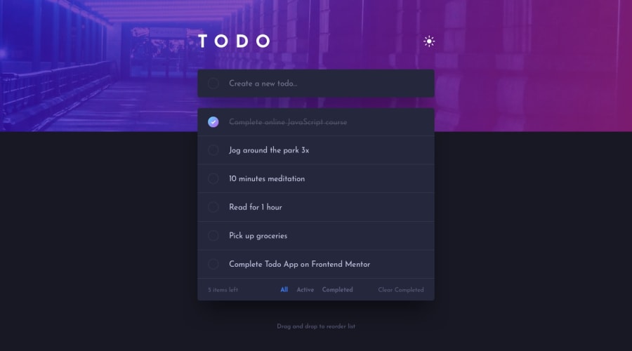
Design comparison
SolutionDesign
Solution retrospective
I would love to get your feedback.
Community feedback
- @yinonheverPosted almost 4 years ago
Nice solution overall. My only note is that responsiveness needs to be improved: on mobile view padding needs to be added, and the filter area needs a little redesign so it won't look too dense on the small screen (see the mobile version of the design files).
0@rahulkhimsuriyaPosted almost 4 years agothanks for your feedback. 🤗 I'll fixed that ASAP.
0
Please log in to post a comment
Log in with GitHubJoin our Discord community
Join thousands of Frontend Mentor community members taking the challenges, sharing resources, helping each other, and chatting about all things front-end!
Join our Discord
