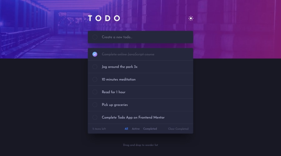
Design comparison
SolutionDesign
Community feedback
- @Kamasah-DicksonPosted over 2 years ago
Your solution looks great but here is some advice.
-
Try to make your solution below 375px screens. You can choose this breakpoint which is the smaller devices or sm devices which is located as the header of your mobile screen when checking for responsiveness using developer tools. Am saying this because your solution overlaps the screen on smaller mobiles. This is because there was no media quarries for max width below 375px screens.
-
Also try to fix the accessibility issue reported.
Besides have a nice day😀🍻 Happy coding💻
Marked as helpful0 -
Please log in to post a comment
Log in with GitHubJoin our Discord community
Join thousands of Frontend Mentor community members taking the challenges, sharing resources, helping each other, and chatting about all things front-end!
Join our Discord
