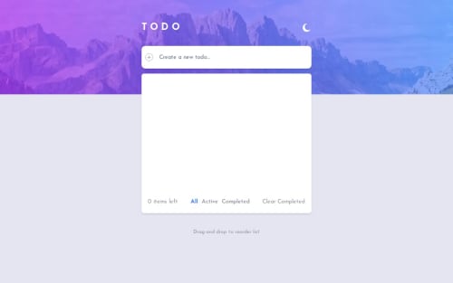
ToDo App [React - Next.js - Tailwind - TS - Sharon - Framer Motion]

Solution retrospective
In general, I am happy how the solution turned out. May be the most challenging part was implementing the DnD to reorder without causing unexpected behaviors due to the filtering.
Built with
- React / Next.js 14 / Typescript
- useLocalStorage & useIsClient custom hooks
- Dark & Light mode using next-themes, including system-preferences / manual control / localStorage
- UI components from Shadcn
- Reorder component from Framer motion
- Mobile first approach
- Tailwind CSS
- Responsive design with Mobile & Desktop view
- Line-clamp on the todo items with text reveal on hover
- Vertical scroll on the todo list with snap-y behaviors for nice UX
- Minor design changes
This definitely was an interesting challenge! As mentioned the reordering feature while having one array filtered 3 times was challenging. The reorder basically takes the original array, applies the new order for each index and then updates the array - this initially resulted in weird behaviors. For example I have Items 1 / 2 / 3 / 4 in my list. Item 2 & Item 3 are marked completed. When I go to the Completed view and reorder those two items, the array get's updated but in the process I lose item 1 & item 4. To tackle this I decided to:
- Add additional logic to onReorder property
- Set 3 different states for the same array
- Use separate tabs for each filter view, instead of using the same list and just change the rendered array based on filtering
Any and all feedbacks are welcome!
I would much appreciate any tips & tricks about:
- Improving my TypeScript usage;
- Sharing any "best-practices" that I might have not implemented;
Please log in to post a comment
Log in with GitHubCommunity feedback
No feedback yet. Be the first to give feedback on DeyanTopalov's solution.
Join our Discord community
Join thousands of Frontend Mentor community members taking the challenges, sharing resources, helping each other, and chatting about all things front-end!
Join our Discord