Todo App - Mobile first Vanilla JavaScript
Design comparison
Solution retrospective
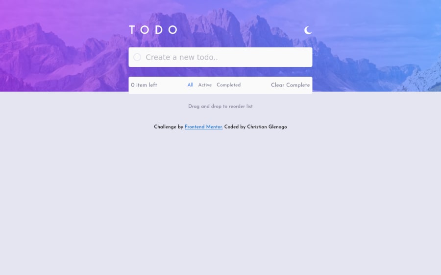
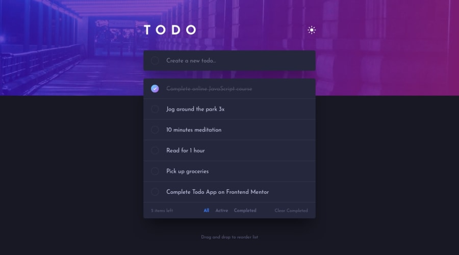
This is quite challenging one. I've learned a lot working this challenge and it take a while to come up with the solution specially the toggle and mobile to desktop design. After all, I guess it works well, for me. But you guys can check my code if you have suggestion/comment just let me know. Ps. I'm still stuck on drag and drop. I'm still trying to make it work. Hope you can help me guys. Thank you!
Community feedback
- @hidayahmsabahPosted about 3 years ago
Hi Christian, loved your smooth transition from dark to light theme and vice versa. For the drag and drop functionality, I referred to a youtube tutorial to achieve that https://www.youtube.com/watch?v=jfYWwQrtzzY, hope it helps you too.
A couple of things to add, it would be best to make sure that the footer font is not as big as the drag and drop div unless you want to emphasize things on your footer as well. I would advise enabling keydown event or handler for pressing the enter key to add an item into the list. Pressing the circle on the left side of the textbox is not quite interactive.
Great job on the rest of the functionality overall!
Marked as helpful0
Please log in to post a comment
Log in with GitHubJoin our Discord community
Join thousands of Frontend Mentor community members taking the challenges, sharing resources, helping each other, and chatting about all things front-end!
Join our Discord
