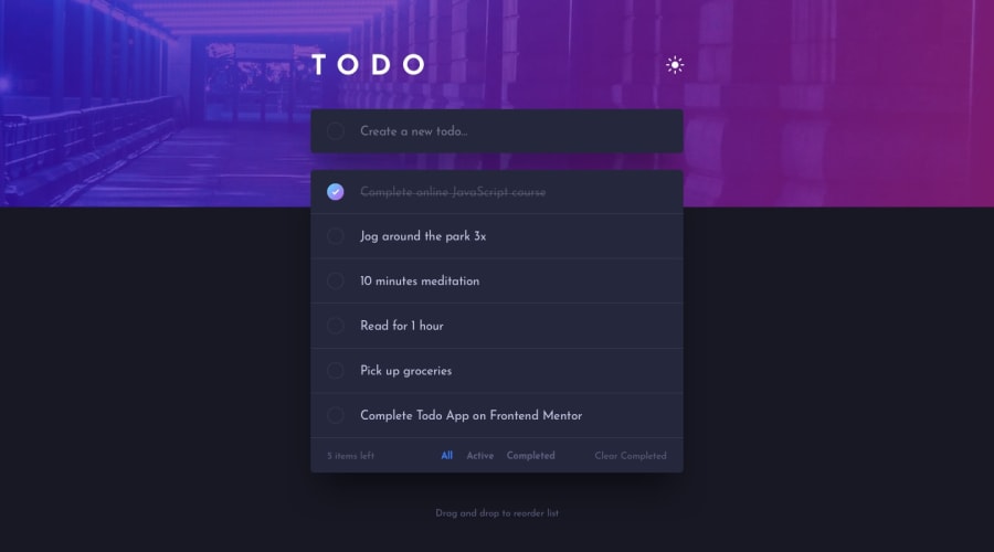
Design comparison
Solution retrospective
Any feedbacks and suggestions are welcome.
Community feedback
- @hidayahmsabahPosted almost 3 years ago
Hi Clifford, awesome job on the app! I especially loved that you disabled the navigation button when no items are in that state (for example, Completed nav is disabled if none of the items are completed yet).
You would want to check on your light theme because when I added an item while I'm in light mode, it switched back to dark mode. Adding top and bottom padding on the create a new to-do div can give a more consistent style with the bottom portion of the to-do lists.
All in all, great job!
Marked as helpful0@cliffordjfedevPosted almost 3 years ago@hidayahmsabah I really appreciate your feedback, I'll fix it. Thank you!
0
Please log in to post a comment
Log in with GitHubJoin our Discord community
Join thousands of Frontend Mentor community members taking the challenges, sharing resources, helping each other, and chatting about all things front-end!
Join our Discord
