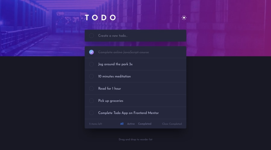
Todo App Main Solution using HTML, SASS, jQuery
Design comparison
Solution retrospective
Any feedback is welcome!
Community feedback
- @grace-snowPosted almost 4 years ago
Hi Axevldk
Good job on this, lots of work!
As this is a todo list, with todo-list-items, I would advise using list and list-item html elements ☺ It's a good general rule, if you find yourself giving an element a class name that is the same as the name of a html element that exists, that's probably the html element you should be using for it
Other things I notice
- drag and drops not working (I'm on mobile)
- the remove buttons aren't visible on light mode until you tap on a list item
- make sure your text input has a label of some kind (aria-label is probably the easiest way to do that)
Really nicely written BEM classes on this, you've made it easy to understand so well done
0 - @ApplePieGiraffePosted almost 4 years ago
Hey, Aleksandr Aksenov! 👋
Nice to see you complete a challenge! Good work on this one! 👏
Your solution looks great and the todo-list and light/dark themes work well! 👍 I especially like the animation that occurs when deleting an item from the todo-list. 🙌
I suggest,
- Increasing the font-size of the todos just a little in the mobile layout (they look a tad bit small).
- Taking a look at your solution report and making the buttons accessible (by labeling them in some way, probably—perhaps with WAI-ARIA).
- Adding a gradient-border to the checkboxes upon hover (as in the original design) would be a nice touch! 😉
Keep coding (and happy coding, too)! 😁
0@axevldkPosted almost 4 years ago@ApplePieGiraffe ~ Thank you for your advice ~
0
Please log in to post a comment
Log in with GitHubJoin our Discord community
Join thousands of Frontend Mentor community members taking the challenges, sharing resources, helping each other, and chatting about all things front-end!
Join our Discord
