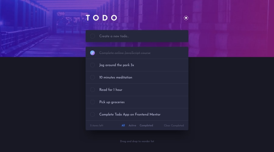
Todo App, Fluid Design through Fluid Typography, sortable, animated
Design comparison
Solution retrospective
I designed this project with a few goals in mind when I started; Use fluid typography and scale everything based on the dynamically changing text size, animate where possible without being obnoxious, and actual usability. The end result is a page that can scale from 4k to mobile screens without needing media queries to change the sizes of things, a couple smooth animations, and a todo list that will save its contents and order per user!
I used the Sortable Library for the moving of the list items to keep things nice, otherwise all custom vanilla JS/HTML/CSS. Really like the way this one turned out.
Community feedback
Please log in to post a comment
Log in with GitHubJoin our Discord community
Join thousands of Frontend Mentor community members taking the challenges, sharing resources, helping each other, and chatting about all things front-end!
Join our Discord
