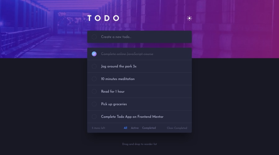
Design comparison
Solution retrospective
as much as challenging it was but I helped me a lot to practice my JavaScript knowledge so far.
What challenges did you encounter, and how did you overcome them?Making the items draggable was quite hard but with searching and trying to solve the problem it finally worked
What specific areas of your project would you like help with?deploying isn't right, when I use the GitHub pages it doesn't show the styles or the scripts of the site. and when building it and upload the dist file only, most icons disappear.
Community feedback
- @Mahmoud-ElagamyPosted 2 months ago
Hi, i've been using your To Do app, and I’m happy to report that most of its features are functioning as intended, and its overall design is user-friendly. However, I did notice an issue with some of the icons that needs to be addressed.
I observed that the checkmark and "X" icons did not load correctly. Instead of displaying the intended icons, a placeholder image is shown, which suggests there might be an issue with the file paths for these icons.
I recommend checking the file paths for the checkmark and "X" icons to ensure they are correctly linked. Once this issue is resolved, users will be able to interact with the app more effectively, allowing them to complete and remove tasks as intended. Good Luck!
Marked as helpful0@Yussif20Posted 2 months ago@Mahmoud-ElAgamy Thanks a lot Mahmoud for your feedback 🙏. Indeed, there was a problem with the path of the icons and now it is fixed.
1
Please log in to post a comment
Log in with GitHubJoin our Discord community
Join thousands of Frontend Mentor community members taking the challenges, sharing resources, helping each other, and chatting about all things front-end!
Join our Discord
