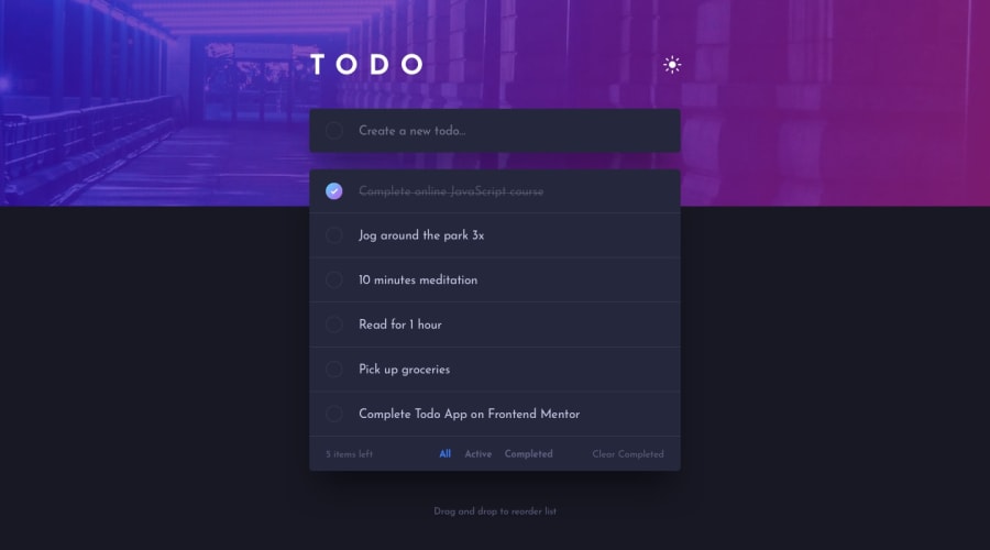
Todo app (Drag&Drop sortable, Save after refresh, Theme Toggle)
Design comparison
Solution retrospective
Any feedback is appreciated!
Community feedback
- @palgrammingPosted over 3 years ago
Looks good but In light mode the circle beside any random to-do is just a empty circle and when the user toggles the circle then it has the fill color and the check appears
but in the dark mode when the circle has not been toggled the check is showing by default even when the to-do is not marked completed
0@rilindtasholliPosted over 3 years ago@palgramming Hi Patrick, In CSS you can't have borders with gradient color. To achieve that, I had to make a div that has a background with gradient colors and the check image in the middle of the div has padding with background color dark or white depending on the theme. This way it gives the illusion that the check has gradient border.
So the check is always visible but because it is provided as a white image, when you toggle light-theme you won't be able to see it because it matches the background color.
0@palgrammingPosted over 3 years ago@rilindtasholli maybe looking at this persons solution will help https://www.frontendmentor.io/solutions/draggable-list-with-sortablejs-KcAr6sqJ5
0
Please log in to post a comment
Log in with GitHubJoin our Discord community
Join thousands of Frontend Mentor community members taking the challenges, sharing resources, helping each other, and chatting about all things front-end!
Join our Discord
