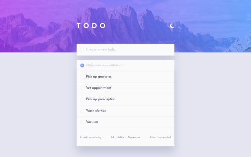
Design comparison
Solution retrospective
Hi. Thank you for viewing my solution. This is my version without the Drag and Drop. I had difficulty adding that functionality to my app. I will be working on a new version with the DND. I would appreciate some feedback. Thanks.
Community feedback
- @PeshwariNaanPosted almost 2 years ago
Hello Trista, nice work on completing the challenge.
Here are a couple things that might help:
-
For these todo lists it is always good to let the user store their list in the local storage so they can come back to what they put down. Implementing this is pretty easy. My code is a little different from yours as I am using a reducer in a context to manage the state but you can still see how I did it HERE
-
Something is wrong with the responsiveness in the mobile view. After I add more that 8 todos, the todo list covers up the bottom nav-bar div and you cannot access the filters once this happens making the app useless at this point.
-
(optional)Try adding some DnD to the list. Drag and drop is a really useful thing to learn. It can be a little confusing at first but check my solution to see how I did it. Once you understand it, it's not bad.
I hope this helps - Happy coding
Marked as helpful0@tlanettepollardPosted almost 2 years ago@PeshwariNaan Thank you. I wanted to add DND, but ran into issues. I am working on another version with the DND. Great point about the responsiveness issue. I didn't even think about a user adding more than 8. I will definitely incorporate. I will also look at storing the list in local storage. Thank you.
0@tlanettepollardPosted almost 2 years ago@PeshwariNaan Hi. I fixed the responsibility issue in mobile. Now I'm having an issue with the background color not going to the bottom of the page. When I add new tasks, the footer is pushed down and the bottom of the page is white. I'm still searching for a reason. Have you experienced this before? T
0@PeshwariNaanPosted almost 2 years ago@tlanettepollard Well after looking at mine - it looks like I have the same issue. I wasn't as skilled as I am now when I wrote this and I have my background set up as a div with an absolute position which I used to keep the background image in place at the top. This makes it difficult to get the background to grow vertically. Because I'm using styled components, I had to create a global style to access the body element and from there I set the background color. I do not have a height property for the body and it works for me. Try playing with your values for the height and see what happens if you totally remove the height rather than using
min-height
and see if that helps. Let me know if it works.0 -
Please log in to post a comment
Log in with GitHubJoin our Discord community
Join thousands of Frontend Mentor community members taking the challenges, sharing resources, helping each other, and chatting about all things front-end!
Join our Discord