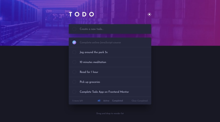
Todo app created with React, Beautiful DnD and Confetti
Design comparison
Solution retrospective
I mostly want to know if the app feels smooth. How is the confetti and transitions? Does it stutter?
I welcome all the feedback I can get because I'm gonna hunt for a job now, so I need it! 😁
Community feedback
- @ApplePieGiraffePosted almost 3 years ago
Hello there, daklo! 👋
Nice work on this challenge! 🙌 I really like all of the extra features that you added! The confetti animation looks great and the to-do list works very well! 👍
A small suggestion I have is to add some focus states to the interactive elements on the page. Currently, only some interactive elements are highlighted when they are tabbed to via the keyboard. It's important to let users know which controls are focused or active so that they know what they are doing when using the page with their keyboard. 😉
Also, it might be worth taking a quick look at your solution report to see if you can clear up a few of the errors that are there in order to improve the accessibility and semantics of your solution. 🙂
Keep coding (and happy coding, too)! 😁
Marked as helpful1@daklo91Posted almost 3 years ago@ApplePieGiraffe Thank you very much! I will get right to it!
1@daklo91Posted almost 3 years ago@ApplePieGiraffe Hi again, and thank you very much for the feedback because I learned a lot from it! I had to do some cool tricks with the CSS pseudo class ":focus-within" and ":focus-visible" which I have on the UL, so if you focus on something inside the UL, then all the delete buttons will be shown. I also added a some instruction text's which will be shown depending on the users device, I hope they are clear and concise enough. Please take a look! 😁
I still have 3 more HTML validation errors, but these are from the react-beatiful-dnd. Two of them are nothing to worry about and the other must be like that for it to work properly. I don't think there is much else I can do, but please tell me if there are!
1@ApplePieGiraffePosted almost 3 years ago@daklo91
Hey!
Sorry for my (very) late reply! I just noticed an email notification for this comment in my inbox! 😅
I'd say everything looks good, now! 👍
Yeah, I don't think you have to worry very much about the HTML errors in the solution report. 😜
The focus states for all of the interactive elements are nice and clear and navigating and using your site via keyboard works great! Good job! 😀
Keep it up!
Marked as helpful1 - @PaienobePosted almost 3 years ago
Awesome work
0
Please log in to post a comment
Log in with GitHubJoin our Discord community
Join thousands of Frontend Mentor community members taking the challenges, sharing resources, helping each other, and chatting about all things front-end!
Join our Discord
