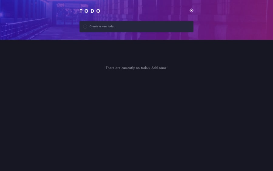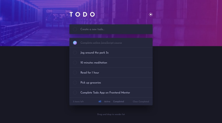
Design comparison
Solution retrospective
This was my first time completing a challenge using Vue3. I recently learnt Vue and wanted to put what I have learnt into practice. I would appreciate any feedback especially in relation to my components and store as I'm not sure if I achieved this in the best way possible.
Community feedback
- @pikapikamartPosted about 3 years ago
Hey, really great work on this one. Layout in general looks great.
I don't know Vue but here are some suggestions on the site:
- It would be great to have a base styling with these properties
html {
  box-sizing: border-box;
  font-size: 100%;
}
*,
*::before,
*::after {
  box-sizing: inherit;
}
This way, handling an element's size will be lot easier because of the
box-sizing: border-box. You can search up some more of how this works.- Your markup for the toggle is not really suited on this one. Also, don't and never use
display: noneon aninputas this removes theinputfrom the dom itself and only mouse can trigger it by thelabel, hence you excluded lots of people to use the toggle. - Now, a proper markup for the toggle is to use 2 radio buttons that are inside
fieldsetalong with a screen-reader onlylegendelement which the text-content should describe what is the purpose of the sets of radio buttons.You can take a look at my solution on this one and see the markup or if you find it hard, you can view this simple jsfiddle of mine about it. Let me know if you have queries about this one. - It would be a great idea to have an
aria-liveelement that will announce the successful insertion of a new todo item. For every successful insertion it could announce like "todo item {name of the todo item} added". This way, users will know what exactly has happened after they fill up the todo-input. - Don't use other html elements other than
liinsideul, it is invalid, onlyliare the ones that should be the direct child oful. - It would be great to include the todo-item-name as the
labeltext so that users can select that as well other than the circle on its left side. - Again, do not use
display: noneon the todo-items, lots are being excluded. - Remove todo should be a button with a screen-reader only text that describe what does the
buttondoes , it could be like:
<button>
  <span class="sr-only"> Remove {todo item name} todo item</span>
</button>
Also other than that, you could use again
aria-livethat will announce it successfully removed the todo item.all, active, completedshould either be list ofbuttonor set of radio buttons. Remember, interactive components should be using interactive elements, usinglialone as the trigger is not great.clear completedcurrently is missing.
This challenge can really help you to test accessibility since there are lots to be considered and used on this one. Still, you did a great job on this one.
Marked as helpful0@Lisa-C-27Posted about 3 years ago@pikamart Thankyou for the in-depth feedback. I really appreciate you taking the time and effort on this. There are definitely a lot of things I didn't consider there, accessibility is one of the skills I am lacking in for sure. I will look into fixing these as per your suggestions.
- The clear completed I made it only appear if there were completed items to clear, so as soon as one item is completed it will appear.
- The
divinside theul, I thought this might have been a problem, but this was due to a vue plugin to make that area draggable it is used as a base for a for loop, I may need to look further into that plugin to see if there are options to change it from adivto aul. Thank you so much!
1@pikapikamartPosted about 3 years ago@Lisa-C-27 Great that it helped with it^^
Also sorry for that clear-completed. I thought it is not include and just assumed that you forgot to add. My bad :>>
0
Please log in to post a comment
Log in with GitHubJoin our Discord community
Join thousands of Frontend Mentor community members taking the challenges, sharing resources, helping each other, and chatting about all things front-end!
Join our Discord
