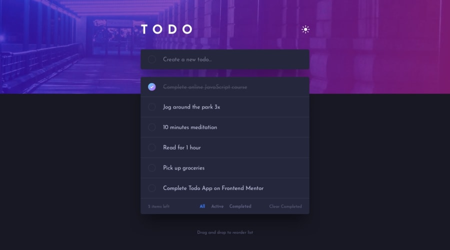
Todo app built with Html, CSS and JavaScript
Design comparison
Solution retrospective
I am most proud of successfully implementing a fully functional Todo app with features like adding, marking, deleting, and filtering todos, as well as drag-and-drop reordering. The integration of advanced features such as light/dark mode toggle and drag-and-drop functionality significantly enhanced the user experience. Additionally, I ensured the app is responsive across various devices, providing a seamless experience on desktops, tablets, and mobiles. Maintaining clean, organized, and well-commented code for easier understanding and future development was also a significant achievement.
Next time, I would invest more time in refining the user interface and experience, possibly through user feedback and testing. Implementing more extensive unit and integration tests to catch issues early and ensure robustness would be a priority. Exploring the use of a state management library like Redux for more efficient state handling in larger applications is another area for improvement. I would focus on performance improvements, such as optimizing load times and animations, and minimizing re-renders. Enhancing accessibility features to ensure usability for people with disabilities, following WCAG guidelines, is also important. Finally, providing comprehensive documentation and exploring scalable, resilient deployment strategies would be beneficial for future projects.
What challenges did you encounter, and how did you overcome them?Implementing features like marking todos as complete, filtering by status, and clearing completed todos presented challenges in maintaining state consistency. To overcome this, I structured the JavaScript code carefully, using functions to update the UI and state consistently, and managing event listeners to avoid conflicts.
Ensuring the app's responsiveness across different devices was another challenge. I adopted a mobile-first approach and used CSS Flexbox and Grid for layout. Regular testing on multiple devices helped ensure a seamless experience.
Handling the light and dark mode toggle required managing theme-specific styles. I solved this by using CSS custom properties for theme-specific styles and toggling classes on the body element dynamically.
Lastly, maintaining code quality and readability was a continuous challenge. I kept the code modular and well-commented, used descriptive variable and function names, and regularly refactored the code to improve performance and readability.
What specific areas of your project would you like help with?I'm seeking help with specific areas of my project to improve functionality and user experience. Firstly, I need assistance in debugging the drag-and-drop feature to ensure that todos can be reordered smoothly. Additionally, I require help in refining the filter functionality to correctly filter todos by their status (all, active, completed). I am also looking for advice on managing the state of the todos more efficiently, especially when adding, updating, or removing items. Moreover, guidance on handling events more efficiently to avoid conflicts and improve performance would be beneficial. Ensuring cross-browser compatibility is another key area where I need tips to make sure the app functions correctly across different browsers and devices. Furthermore, suggestions for enhancing the UI/UX, such as better transitions, animations, and overall user interactions, would be greatly appreciated. Lastly, I would welcome feedback on the existing codebase to identify areas for improvement in terms of readability, performance, and maintainability.
Community feedback
Please log in to post a comment
Log in with GitHubJoin our Discord community
Join thousands of Frontend Mentor community members taking the challenges, sharing resources, helping each other, and chatting about all things front-end!
Join our Discord
