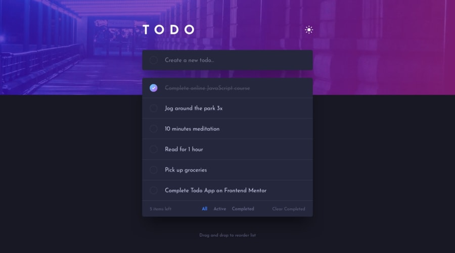
Todo app + authorization (React, Reducer, Context, Firebase, Sass)
Design comparison
Solution retrospective
What I find the most intimidating task in this challenge is the how to separate the 3 filter buttons out of the todo list in mobile view. My solution just looks nearly to the design, but without the shadow at the bottom of todo list. The second most intriguingly task is to style the border of checkmark linear gradient because CSS does not support it natively. I'm interested in how you guys solve these 2 styling challenges.
Community feedback
- @miroslavdurinPosted over 2 years ago
Hello, I would suggest using a custom hook which retrieves media dimensions of screen. I usually use
useMediaQuery()hook. You can copy a hook code on this LINK.Then you can have two versions of
div.bottomand use which one you need, based on the screen size. I hope this helps...Marked as helpful1@xuanhung1509Posted over 2 years ago@miroslavdurin Thanks, definitely helpful! At first, I tried to handle this layout with purely CSS, but it still missed the box shadow. Your approach made things much more easier!
1
Please log in to post a comment
Log in with GitHubJoin our Discord community
Join thousands of Frontend Mentor community members taking the challenges, sharing resources, helping each other, and chatting about all things front-end!
Join our Discord
