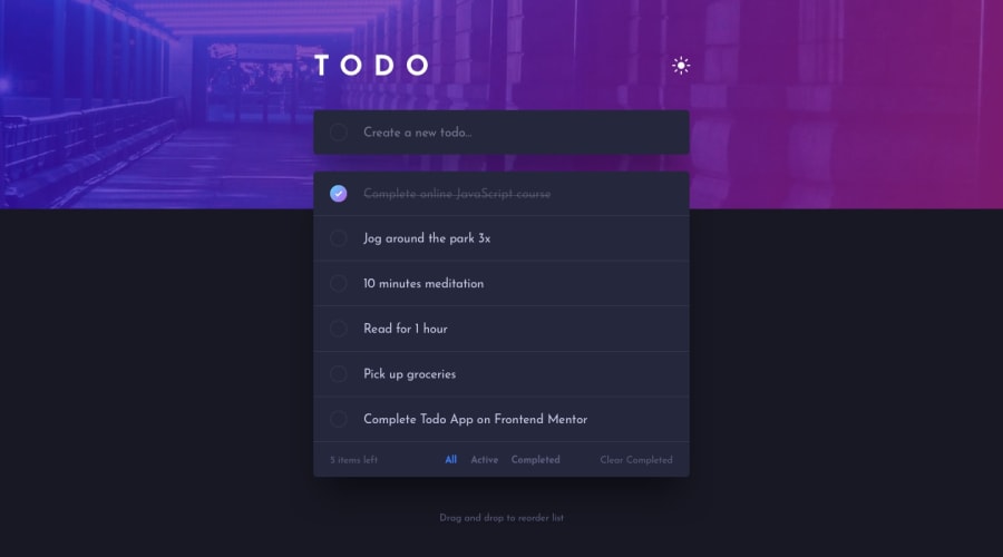
Design comparison
Solution retrospective
The most difficult part was probably figuring out how to set dark/light mode that recognises the default theme of a user's PC and simultaneously have a button switching fluently between those 2 (no matter which theme was recognised).
Challenging was also creating the footer that is merged in the desktop view but not merged in the mobile view.
It also took me some time to debug everything and make it bug-free, hopefully.
Any advice about better practices of anything within HTML, SCSS and JS is welcome. I feel like I struggle with clean SCSS and clean JS code. Not sure to what extent, though, as I have no one to compare myself to.
Community feedback
Please log in to post a comment
Log in with GitHubJoin our Discord community
Join thousands of Frontend Mentor community members taking the challenges, sharing resources, helping each other, and chatting about all things front-end!
Join our Discord

