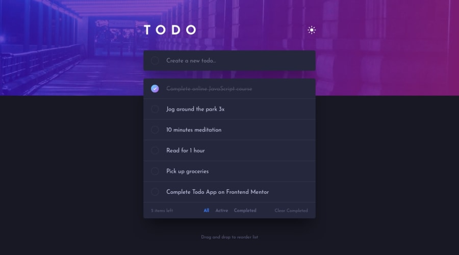
Design comparison
SolutionDesign
Solution retrospective
any feedbacks are welcome. it help me so much thanks in advance 🙏
Community feedback
- @ApplePieGiraffePosted over 3 years ago
Hey, Karim! 👋
Well done on this challenge! 👍
I suggest,
- Allowing users to mark items as completed by clicking on the item itself (not just the checkbox next to it), to make things a little easier.
- Making sure the to-do items decrease in width with their container in the tablet/mobile layout (currently, they keep their desktop width and stick out past their container a bit).
- Adding a favicon to your site (that code seems to be commented out in the
<head>). - Taking a look at your solution report and trying to clear up some of the errors that are there.
Keep coding (and happy coding, too)! 😁
1
Please log in to post a comment
Log in with GitHubJoin our Discord community
Join thousands of Frontend Mentor community members taking the challenges, sharing resources, helping each other, and chatting about all things front-end!
Join our Discord
