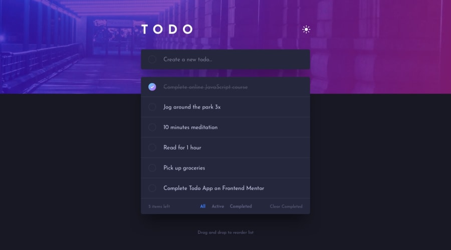
Design comparison
Solution retrospective
Hi here is my solution for Todo-app. I used HTML, CSS, JS.
What challenges did you encounter, and how did you overcome them?First It was to create the todo-list. I learned how to do a todo-list with an input and add some value and tag to a list using ul for the container and li for the item to add.
document.querySelector('.list').innerHTML += `
                        ${value}
                        `;
And then it was to do the drag and drop, it was a new concept to me.
I learned how to make a drag and drop to change a list, using some listener ondragstart="dragStart(event)", ondragend="dragStop(event)", ondragover='dragOver(event)'
Feel free to leave any comments or suggestion.
Thanks.
Community feedback
- @dylan-dot-cPosted 7 days ago
Everything here is looking great, responsive and drag and drop works nice.
Here are a few improvements.
- You can make use of localstorage so the user todos can persist after reload or using it on another day. You can also use it for the dark-mode as if I put it on light, and refresh it will go back to dark.
- There is a better way of implementing dark mode for this website. 1. Make use of the
:root{}selector not only for mobile/desktop size but for the colors as well, this can help you remove all the redundant.darkclass name from your code and reduce the lines needed. You can usedata-themeattribute instead of the class. Your CSS would be something like this
:root html {
/* colors for light mode */
}

:root html[data-theme="dark"] {
/* colors for dark mode */
}
With this you must use the variables declared here for your styling and webpage colors and when you use js to switch to dark-mode it will automatically switch colors as
:root html[data-theme="dark"]has a higher specificity which will make it override the light-mode colors.Another thing, the functionality, especially for the active and completed todos, I think is weird, although I see why you did it that way. I think all todos, once created, are active, so all todos that aren't completed should be on the active tab, not only the ones you have to click the rounded checkbox for. Also todos are completed not by only clicking the text but the rounded checkbox so that's what should happen.
Other than that, you did a great job and all the best when working on these improvements.
Marked as helpful1@Lo-DeckPosted 6 days agoThanks @dylan-dot-c for your comment and your advice. I didn't know the
data-theme="dark", to help me to improve the readibility.1@dylan-dot-cPosted 6 days ago@Lo-Deck no worries, it's actually just like a different way of doing it as tailwindCSS uses the
.darkclass in the document. But the data-theme is like semantic HTML, it doesn't offer much functionality but it's what you do with it. It also isn't an actual special value, it just makes use of thedata-*attributes in HTML, which you can do anything with really.Marked as helpful1
Please log in to post a comment
Log in with GitHubJoin our Discord community
Join thousands of Frontend Mentor community members taking the challenges, sharing resources, helping each other, and chatting about all things front-end!
Join our Discord
