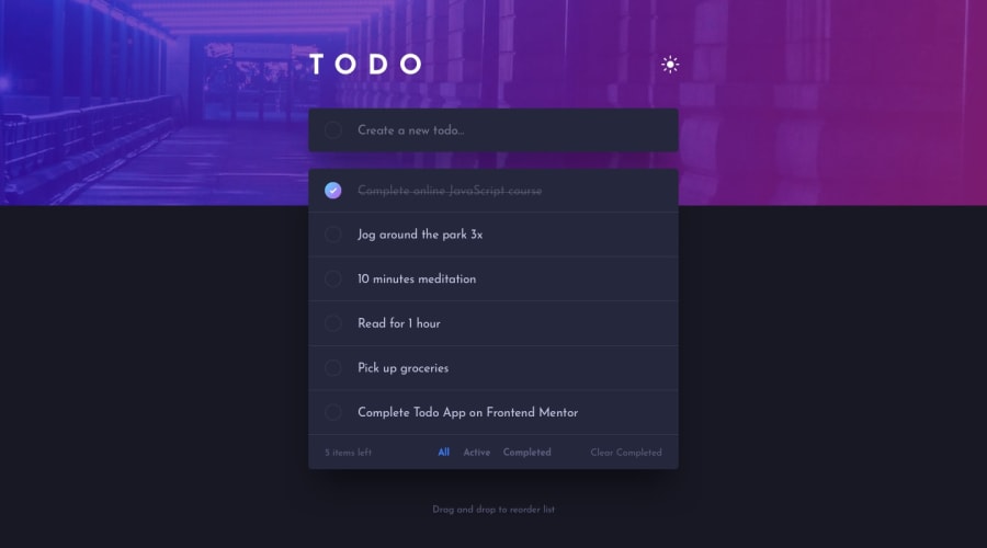
Design comparison
Solution retrospective
I'm proud to have learned about building and using classes, persisting data with local storage, and reorganizing items in the list.
What I would do differently would be: first research and better structure the code architecture to avoid major changes throughout the project.
What challenges did you encounter, and how did you overcome them?I had problems with how to build and store application data locally. After some studies I found the best way to carry out and execute these functionalities and managed to overcome this obstacle.
What specific areas of your project would you like help with?Drag and Drop for smartphones Filter that finds the exact item I want to manipulate even if there are others like it.
Community feedback
- @mike15395Posted 4 months ago
@igorG7 Congratulations on completing the challenge!
Your design is perfect and responsive as well. I would just like to add small improvement(Edge case):- If a TODO is more than 45 characters long then to see that particular TODO in the list there is horizontal scroll, which makes it hard to read. To fix this you can wrap long characters (>45) into wrap css property, so that it is easily visible without scrolling.
Also do include a good README in your repo so that your thought process and logic building is clearly understood.
Hope this helps to further improve your solution.
Keep Growing! Happy Coding:)
0
Please log in to post a comment
Log in with GitHubJoin our Discord community
Join thousands of Frontend Mentor community members taking the challenges, sharing resources, helping each other, and chatting about all things front-end!
Join our Discord
