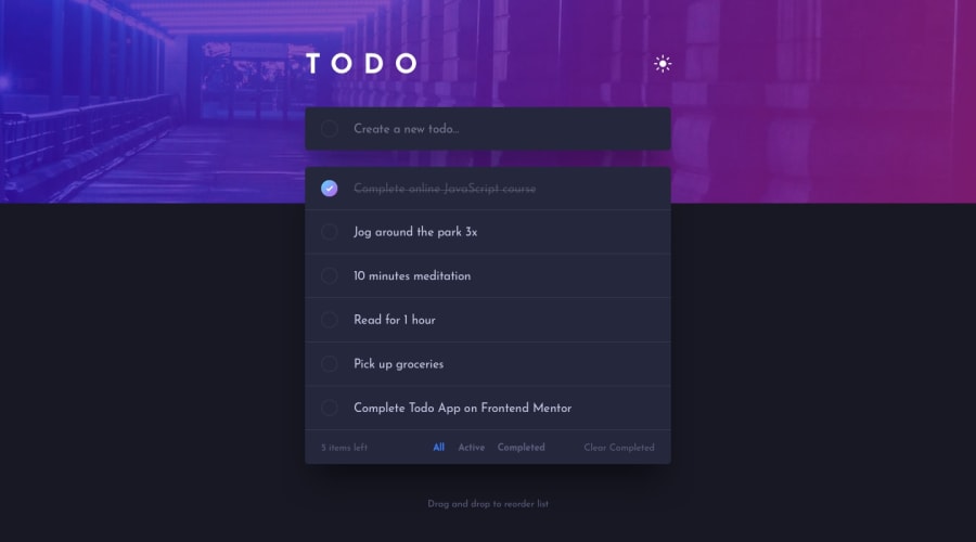
Design comparison
Solution retrospective
Well, I learnt a lot from this project, i'm happy of the results, there are some things I want to improve but i'm happy with this project
What challenges did you encounter, and how did you overcome them?I had to fix some bugs, I get stuck a couple days with some bugs, but It works
Community feedback
- @NeoScripterPosted 2 months ago
Hey, I viewed your solution and would like to give a few suggestions for improvement: 1) The background image does not change while switching the theme. You could leverage CSS custom properties to specify a path to the other image when the theme changes. Also, I think it would be better to make the background-size contain instead of fit, as I can see only the top of your bg image now; 2) The font color for todos in dark mode is too pale, I can barely see it. 3) When I drag and drop in the middle of the rows, flex-direction becomes row for some reason instead of column. Basically, the todos start stacking in a row instead of a column. You could look into todo box parent CSS properties to find the reason. 4) I would add adding a todo with an enter button for convenience. I hope these suggestions help!
Marked as helpful1@jennawlin3Posted 2 months ago@NeoScripter thank you for your feedback, I will check that
1
Please log in to post a comment
Log in with GitHubJoin our Discord community
Join thousands of Frontend Mentor community members taking the challenges, sharing resources, helping each other, and chatting about all things front-end!
Join our Discord
