Design comparison
SolutionDesign
Solution retrospective
Hi! I am waiting for your feedback!🧐 Many many thanks😁🤙
Community feedback
- @Deevyn9Posted over 2 years ago
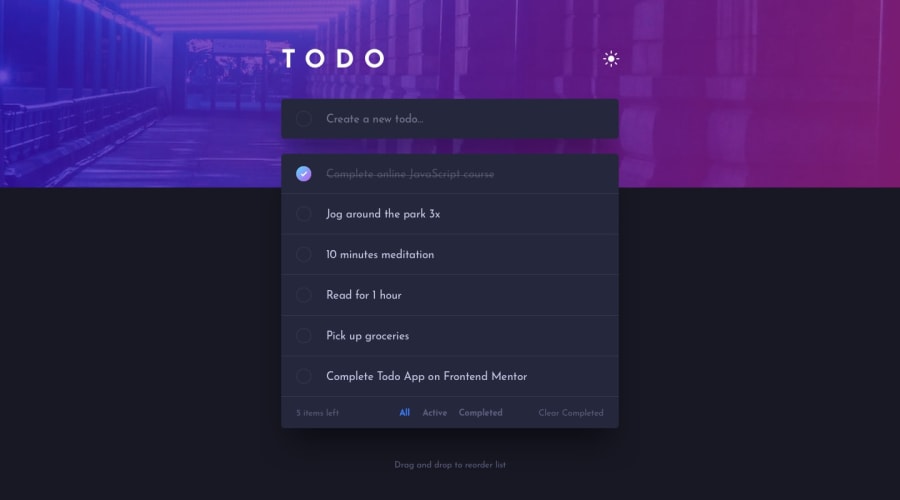
Hi Daniel, excellent representation right here, everything seems to be functional. The delete “X” button doesn’t seen to appear until you tap on the todo item, fixing it would be great. Good luck
1@gdcristeaPosted over 2 years agoHi @Deevyn9. Regarding the x button, I did it on purpose. I want to see it when the mouse is over a particular to-do. I like it much more this way😃. Thanks👍
0@Deevyn9Posted over 2 years ago@gdcristea that’s a great approach too, you’re welcome!
0
Please log in to post a comment
Log in with GitHubJoin our Discord community
Join thousands of Frontend Mentor community members taking the challenges, sharing resources, helping each other, and chatting about all things front-end!
Join our Discord
