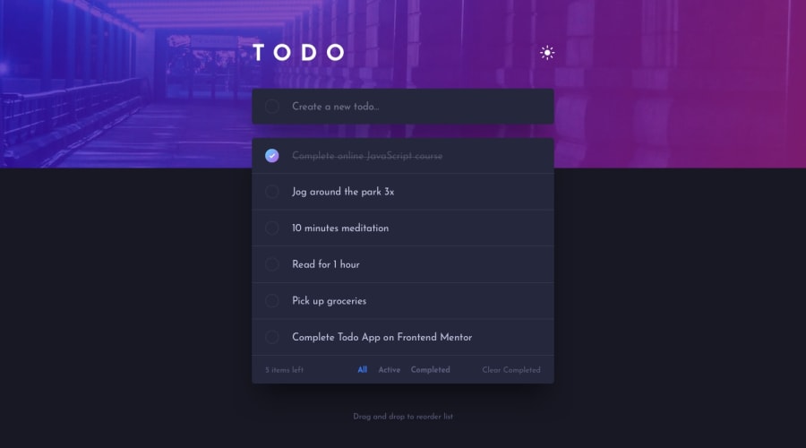
Design comparison
Solution retrospective
This was an interesting challenge. I enjoyed working on it. I am yet to implement the bonus feature though(drag and drop). Any suggestions about ways I may approach this feature are welcome. Otherwise, any feedback on how I could make this look better is highly appreciated!
Community feedback
- @ApplePieGiraffePosted over 2 years ago
Hey there, Treasure Kabareebe! 👋
Nice job on this challenge! 👏 Your solution looks great and works very well! 🙌
A couple of things I'd like to suggest are,
- Perhaps increasing the size of the text in the mobile view just a bit (as it seems a bit small, at the moment).
- Using
buttonelements for the theme toggle element and the filters at the bottom of the to-do list to make your HTML more semantic and accessible. - Taking a look at your solution report and trying to clear up some of the errors that are there in order to improve your solution.
- A good library to help implement drag-and-drop functionality would be React beautiful-dnd! Check it out here!
Hope you find this helpful. 😊
Keep coding (and happy coding, too)! 😁
Marked as helpful2@trekabPosted over 2 years ago@ApplePieGiraffe, thanks for the feedback. This is very helpful. I will definitely make the adjustments.
Happy coding to you too!
1
Please log in to post a comment
Log in with GitHubJoin our Discord community
Join thousands of Frontend Mentor community members taking the challenges, sharing resources, helping each other, and chatting about all things front-end!
Join our Discord
