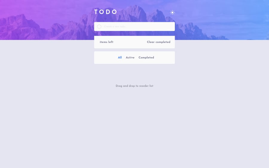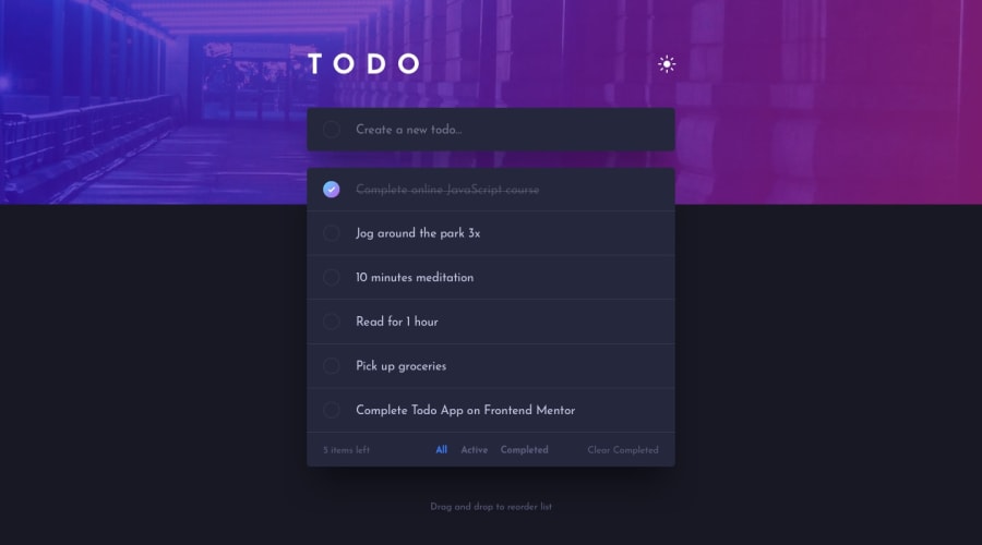
Design comparison
Solution retrospective
Hello, good people on Frontend Mentor :). This is my solution for this challenge. It's not perfect, but I'm so proud of it because it's my first project with more javascript. I hope it's not so bad, please for some feedback :)
Community feedback
- @visualdennissPosted over 1 year ago
Hey Anette,
Congrats on completing the challenge successfully! Your solution looks really good and responsive, you have all the right to be proud of it! : ). All the JS Logic functions flawlessly as well.
I do have a one small suggestion to improve user experience is that, it looks like you need to press enter to add a new item, you could perhaps also add a plus icon while hovering over the circle button in the input and make it cursor: pointer; so that making user think that clicking on it will add new item. I just thought it might be useful that there is an option to add items onclick in addition to the keydown event :) But that's totally optional ofc. Keep up the amazing work.
Hope you find this feedback helpful!
Marked as helpful1
Please log in to post a comment
Log in with GitHubJoin our Discord community
Join thousands of Frontend Mentor community members taking the challenges, sharing resources, helping each other, and chatting about all things front-end!
Join our Discord
