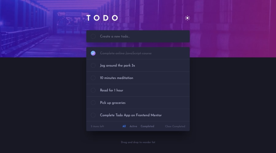
Design comparison
Solution retrospective
Feedback welcome
Community feedback
- @SenatriusPosted almost 2 years ago
Not bad, it looks pretty good. There are a couple changes you could make to make it even better.
-
The circle in the todo input field: Instead of trying to eyeball the center using margins, you could add
display: flex; align-items: center;to the div wrapping the circle, similar to how you centered the button and span elements in the todo rows. -
Checkboxes instead of buttons: After all, it is a checklist of items and that's what checkboxes are best used for. And it comes with a lot of accessibility already built in that you don't have to add yourself when using regular buttons. This is generally what it would look like...
<div class="todo item">
    <input id="random id" type="checkbox">
    <label for="random id">This is a todo item</label>
</div>
Of course this code is very simplified and you'd have to adjust it to fit your own code. I recommend checking this blog post out to see how to style a custom checkbox to match the design. It's not the exact same use case, but the concepts are similar enough. https://blog.logrocket.com/building-custom-checkbox-react/
Outside of that, it seems good to me :) Keep it up.
Marked as helpful1@Levy-JrPosted almost 2 years ago@Senatrius I forgot to align the todo input button 😅. Thanks for the feedback
0 -
Please log in to post a comment
Log in with GitHubJoin our Discord community
Join thousands of Frontend Mentor community members taking the challenges, sharing resources, helping each other, and chatting about all things front-end!
Join our Discord
