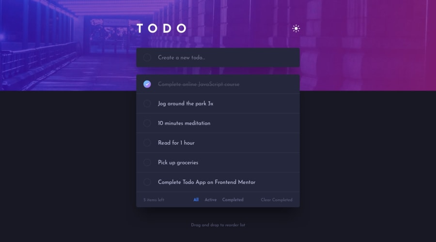
Design comparison
Solution retrospective
Hello Front End Mentor~ This is my first attempt of this problem This problem is really challenging, so i have to learn many new things :) In this problem I learned :
- Dark Mode using context
- State Management
- Drag and Drop
- Local Storage
I'm going to implement Animation in the next submission.
If you have any advice for me about code optimization or the references to learning what I want to implement is really welcome
Cheers
Community feedback
- @pikapikamartPosted about 3 years ago
Hey, great work on this one. The layout looks good in general, the functionality works though the
alertpopping up could be removed or just be replaced by anaria-liveelement, stating what the user had added.Some other suggestions would be:
- Using local storage for the todo items would be really great, if you want to add of course:>
- Always have an
mainelement that will wrap the whole main content of the webpage. For this one, theappselector could have usedmaininstead ofdiv. - The
imgthat you use for the top part background could have only been used incssyou don't really need to create animgfor them, but since you made it this way, usealt=""andaria-hidden="true"on them, since those images are just for decoration. - Do not use the word
T O D O. If you encounter like this, do not explicitly type that in thehtml, what will happen is that, screen reader will read it by letter and not word, just usetodoand usetext-transform: uppercaseto make capital. - The colormode toggler should have been using
input type="radio", since it is a selection of color mode right, radio buttons are intended for those. Along withfieldsetandlegendto describe what the group of radio button does. - The
inputlackslabelon it to describe what it does, or you could make use ofaria-labelon it. - The circle image on the left side of the
inputneeds to havealt=""andaria-hidden="true"since it is just decoration. Also theimgused on the todo item toggle. - Avoid using
height: 100vhon an element, because this will only use the remaining viewport's height. Inspect your layout in dev tools at the bottom, you will notice that if you hover on thebodytag, it does not capture the whole layout. Instead, usemin-height: 100vhon it, this takes full viewports height and will expand if it needs to. - Each todo item should have been using
lielement since those are "list" of todo items. - The toggle on the left side of the todo item should have been using
input type="checkbox"since that is a checkbox if a user have completed it. The text on the right side of it should have been usinglabel, which is connected to theinputon the left side. Usingbuttonalone will not give any extra information to the user about what will happen if they toggle it. - The
buttonfor the remove todo item should havearia-label="remove todo item {name of the todo item}", this way user would know what thisbuttondoes, theimginside as well should have been usingalt="". - Those selection below should have been inside a
ulelement ,since those are "list " of selections or you could have usedinput type="radio"on those since like I said, they are selections. Usingptag alone is not really accessible, if an component is interactive, use interactive element on them. - The clear completed
buttonshould have an extraaria-liveelement, to which will say that the completed todo items have been removed. Also, usebuttonon it, notptag.
Aside from those, great job on this still.
Marked as helpful0
Please log in to post a comment
Log in with GitHubJoin our Discord community
Join thousands of Frontend Mentor community members taking the challenges, sharing resources, helping each other, and chatting about all things front-end!
Join our Discord
