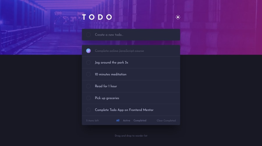
Design comparison
SolutionDesign
Solution retrospective
Your valuable feedbacks are always welcomed
Community feedback
- @ApplePieGiraffePosted over 3 years ago
Hi, Keshav Arora! 👋
Well done on this challenge! 👍 Overall, the to-do list looks nice and works rather well! 🙌
A few things I'd like to suggest are,
- Making sure users can't add empty to items to the to-do list.
- Allowing users to mark items as completed by clicking on the name of the item (rather than just the checkbox itself).
- Adding
cursor: pointerto the theme-switch button.
Keep coding (and happy coding, too)! 😁
0@keshavarora2000Posted over 3 years ago@ApplePieGiraffe Will figure out these things soon. Thanks for the suggestion man. and thanks for the appreciation too
0
Please log in to post a comment
Log in with GitHubJoin our Discord community
Join thousands of Frontend Mentor community members taking the challenges, sharing resources, helping each other, and chatting about all things front-end!
Join our Discord
