Design comparison
Solution retrospective
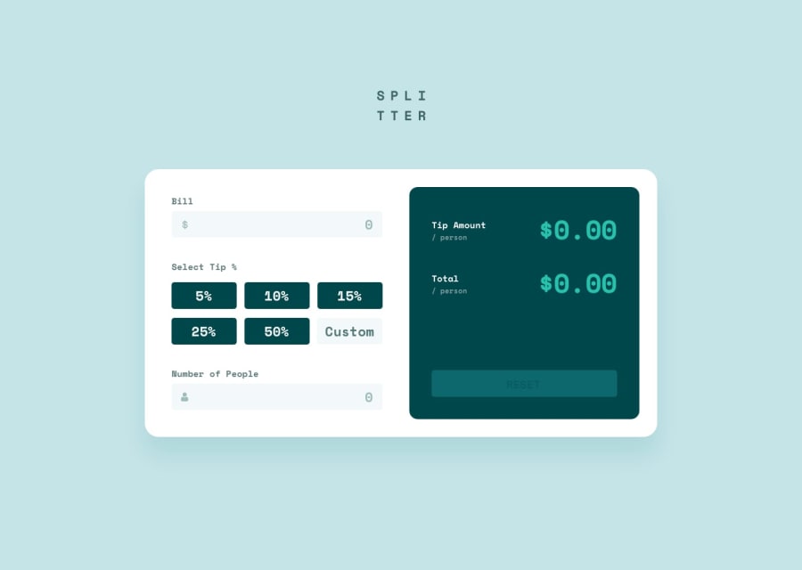
Hello, this is my biggest project at this moment. That challenge had a lot of logic and it was perfect to train my programming skills. NOTE: If you want to test custom tip, press "enter" after type a value.
Community feedback
- @visualdennissPosted over 1 year ago
Great job completing this challenge successfully and making it fully responsive! Looks great overall.
My suggestion would be to set the breakpoint for switching to mobile view a bit higher as in tablet view, sometimes the page content overflows the viewport. E.g. 880px as a breakpoint could solve this. Tablet design is usually for 768px, so it will cover this as well.
Hope you find this feedback helpful!
Marked as helpful0 - @0xabdulkhaliqPosted over 1 year ago
Hello there 👋. Congratulations on successfully completing the challenge! 🎉
- I have other recommendations regarding your code that I believe will be of great interest to you.
HTML 🏷️:
- An
h1heading should primarily be used to identify the content on the specific page within the website and be placed at the beginning of the main content to provide an important navigation point for users of assistive technologies, allowing them to easily find the main content of the page.
- Including both a
mainlandmark and anh1element provides a redundant way for users of assistive technologies to find the main content of a web page.
SUMMARY:
- If the page contains
h1element and either amainorbannerlandmark, theh1element must be a child of either themainorbannerlandmark.
- NOTE:
h1must be inmainorbannerlandmark
- So, nest the
<h1>Spli tter</h1>inside themainelement
I hope you find this helpful 😄 Above all, the solution you submitted is great !
Happy coding!
0
Please log in to post a comment
Log in with GitHubJoin our Discord community
Join thousands of Frontend Mentor community members taking the challenges, sharing resources, helping each other, and chatting about all things front-end!
Join our Discord
