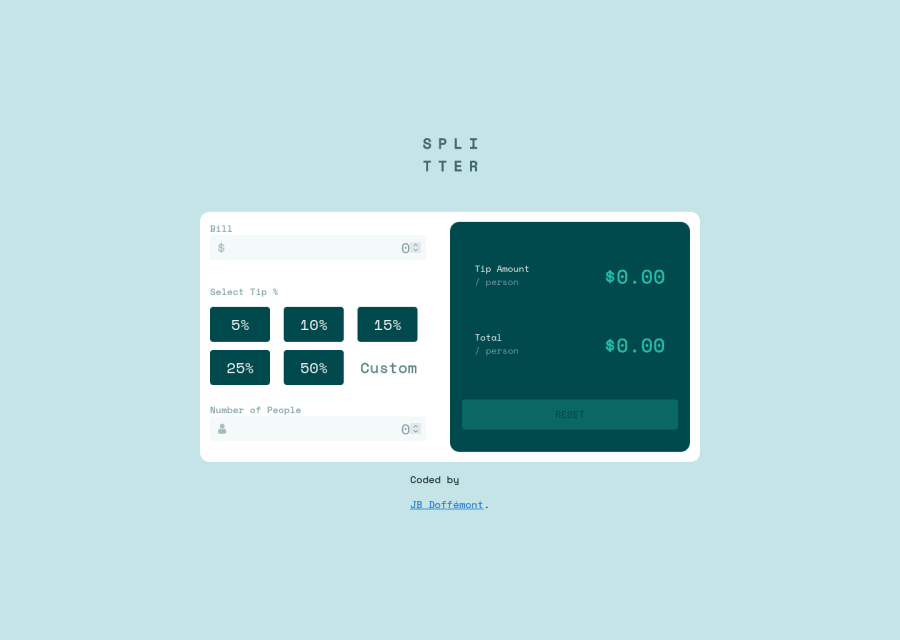
Design comparison
Solution retrospective
Tried to practice SASS for the first time. My js does the work but I don't think is optimal.
I'll be grateful on any feedback on best pratices :)
Community feedback
- @dtomicicPosted over 2 years ago
I've taken a look at your JS and I would recommend you trim it down a lot since there's a lot of code that could be done simpler. I've done it by having the reset button reset all the values to zero, then I have a function that calculates the tip and the total amount in which I've selected all of the tip buttons with the class and I have a simple if/else if going through the array with classes, then for the total amount I just took the amount of the bill divided by the number of people and add the tip onto that.
I've managed to do it in 127 lines of code compared to your 216 lines. You can take a look at my Github to get the idea and it might help you a bit. Since the more code you have easier it is to get lost in it and something not to work haha.
I also see that your calculator doesen't recalculate on tip change (say you put 100$ bill with 5 persons and you put 5% and it calculates good but then you want to change the tip to 10% it doesen't recalculate because your probably listening only for change on bill and person input, you should change that).
Also I would recommend not to reload the document every time you click reset, you could just set the values of the field to empty and set the rest of the values to 0.
And this is not a big problem but you could try to fix it to practice your JS, when you get to really high numbers the amount just displays zero so try to play around with that ;)
You should also look into fixing the design and making it more responsive, I'd recommend getting rid of the media query with max-height and width property and instead just make a box and put a max-width on that box and make a media query with min-width of 1440px for desktop design and then just widen the box a bit and it should look good since now its good up to 376px then it all gets pushed together and it's unuseable until after 1200px so I would recommend taking a look into that.
I'd be glad to give you a hand if you're stuck somewhere so feel free to reply to this comment or get in touch with me somehow else (you can check my Github for my contact info) and I'll gladly help you out with your problems, take care :D
Marked as helpful1@JB-DoffemontPosted over 2 years agoHello @dtomicic !
First of all thanks for your time and your feedback ! I'll do my best to apply the advices you gave to me and i'll try to improve the app and trim down a bit my js.
I'll looked at your solution and it's really clear and understable, well done ! :D
I might get it touch with you through github as I still a bit confuse on some details.
Have a nice day :)
1
Please log in to post a comment
Log in with GitHubJoin our Discord community
Join thousands of Frontend Mentor community members taking the challenges, sharing resources, helping each other, and chatting about all things front-end!
Join our Discord
