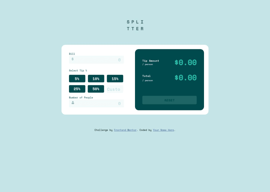


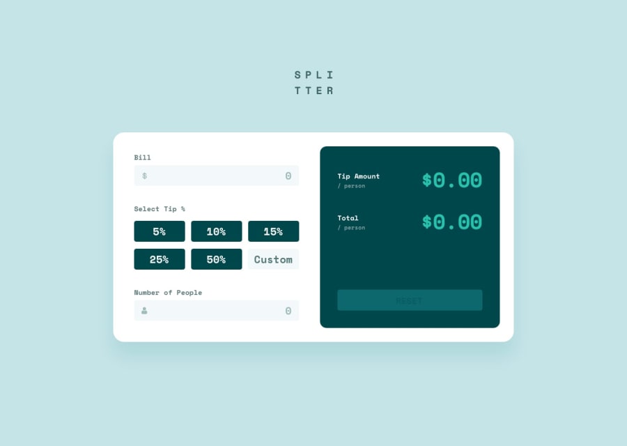
Design comparison
Solution retrospective
I don't know how to make it Responsive for mobile....All my submition looks terrible on mobile.
Community feedback
- @RoksolanaVeresPosted over 1 year ago
Hi, Sagar! I've checked your solution and want to share some ideas with you on how to make it responsive for mobile devices.
First of all, you should use media queries to make some elements change their properties whenever the screen reaches a certain width at which the design looks weird. In case you are not familiar with media queries, watch this video:
https://www.youtube.com/watch?v=yU7jJ3NbPdA&ab_channel=WebDevSimplified
So, I've tried to make your page responsive, and here are some changes that I've made: In your HTML file, I removed classes b1 and b2 for 2 separate lines of buttons and wrapped all 6 buttons in one buttons-container:
 <div class="buttons-container">
            <button>5%</button>
            <button>10%</button>
            <button>15%</button>
            <button>25%</button>
            <button>50%</button>
            <input type="number" placeholder="Custom" />
          </div>
then in your CSS, I added the following styles for the newly created buttons-container:
.buttons-container {
  display: grid;
  grid-template-columns: repeat(3, 1fr);
  gap: 18px;
}
At this point you have to remove width: 30% from buttons and width: 29% from .tip input
Then, at the end of your CSS file add the following media queries:
@media (max-width: 950px) {
  .main {
    flex-direction: column;
    width: 60%;
    min-width: 400px;
  }

  .reset {
    margin-bottom: 25px;
  }
}

@media (max-width: 400px) {
  .main {
    width: 100%;
    min-width: unset;
  }

  .buttons-container {
    grid-template-columns: repeat(2, 1fr);
    gap: 18px;
  }
}
You can also change the font size for some elements on smaller screens, and adjust margins and paddings, but I suggest that you do it when you're more comfortable with media queries, so for now, just learn them.
That's all for now, have a nice day and happy coding 🙂
UPDATE: I forgot to mention that you'd better also set a min-width to your .main container to prevent it from excessive shrinking, like:
.main {
    background-color: white;
    border-radius: 20px;
    display: flex;
    margin-top: 5%;
    width: 55%;
    min-width: 920px;
}
Marked as helpful1@leoemnPosted over 1 year ago🙏🙏🙏🙏 thank you very much,I will add this. @RoksolanaVeres
1

Please log in to post a comment
Log in with GitHub
Join our Discord community
Join thousands of Frontend Mentor community members taking the challenges, sharing resources, helping each other, and chatting about all things front-end!
Join our Discord