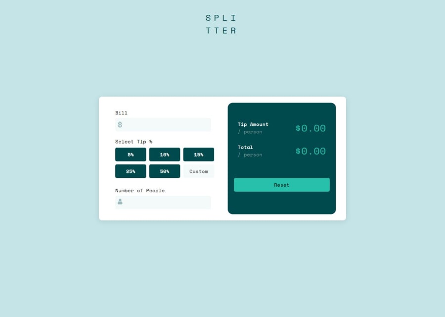


Design comparison
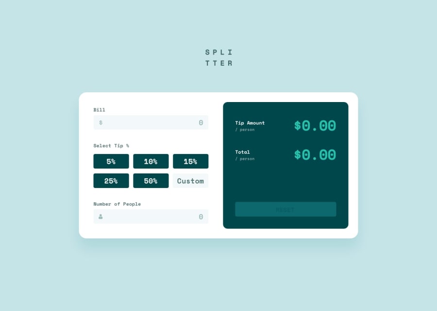
SolutionDesign
Community feedback
- @percydocomoPosted 3 months ago
In mobile version, it needs some margin between the tip total div and the container div. There are some different between your active state effects and the original. You're also missing the red border and error message when the number of people is set to zero. Most importantly, your app calculates a tip total when it should be a tip amount per person. Whereas, the total amount per person becomes the tip amount per person which is completely different from the project.
Marked as helpful0

Please log in to post a comment
Log in with GitHubJoin our Discord community
Join thousands of Frontend Mentor community members taking the challenges, sharing resources, helping each other, and chatting about all things front-end!
Join our Discord