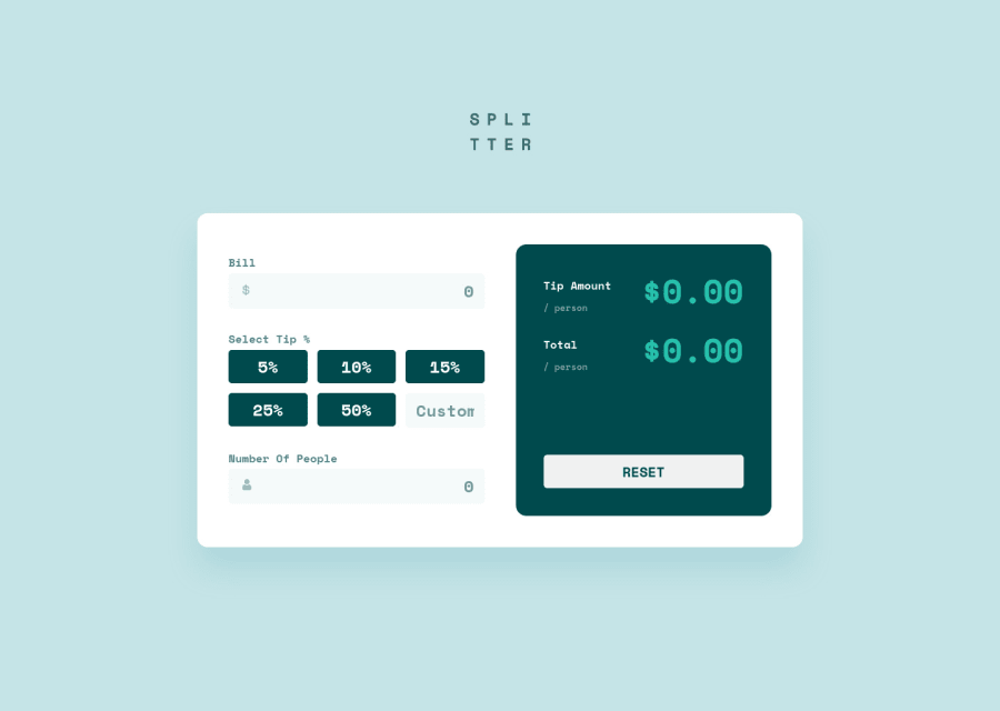
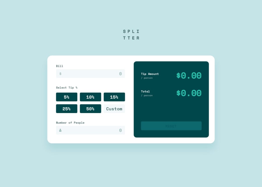
Not Found
Not Found
Not Found
Not Found
Not Found
Not Found
Not Found
Not Found
Not Found
Not Found
Not Found
Not Found
Not Found
Not Found
Not Found
Not Found
Not Found
Not Found
Not Found
Not Found

Submitted

Tip Calculator

P
Oscar 260

@OscarRobertRodriguez

Desktop design screenshot for the Tip calculator app coding challenge

This is a solution for...

  • HTML
  • CSS
  • JS
2junior
View challenge

Design comparison


SolutionDesign

Solution retrospective


Not sure if I did this the best way js wise but I tried my best. Any ideas on my code if it looks clean?

Community feedback

@pikapikamart

Posted

Hey, awesome work on this one. Layout in desktop looks fine, it is responsive though your breakpoint of 1250px is too early to show the mobile state, you could made use more of the screen-time for desktop view. Mobile layout looks great.

Some suggestions would be:

  • Website-logo img should be using the website's name as the alt like alt="splitter". Remember that a website's logo is meaningful so always make sure it uses the proper alt value.
  • Those text above each input should or could be the label for them since it make sense to associate them to the input .
  • The error-messages could just use a p tag instead of heading.
  • Each input icon on its left side should be hidden. Decorative image must be hidden at all times by using alt="" and extra aria-hidden="true" attribute on the img tag.
  • Currently, the error is only for visually but other users won't know about that. To make it more accessible, a pseudocode looks like this:
if ( input is wrong )
  input.setAttribute("aria-invalid", "true");
  input.setAttribute("aria-describedBy", id of the error-message);
else 
  input.removeAttribute("aria-invalid");
  input.removeAttribute("aria-describedBy");

The error-message element should have an id attribute which is referenced by the aria-describedBy attribute on the input element. By doing that, your user will know that the input is wrong because of aria-invalid and they will know what kind of error they made because of the aria-describedBy. This way you are making your component more accessible not only for sighted users.

  • Since you are using button for the tips, it would be great to have an aria-live element that announces that a certain button-tip has been selected. Because using button alone is not informative enough, by creating aria-live users will be informed that they made a selection. You could search more about aria-live on the net.
  • The custom input needs to have a label associated to it or an aria-label attribute. The value will describe what the input is all about or needs like aria-label="custom tip percentage".
  • Visual indicator for every input and button needs to be adjusted. Right now, it is hard to tell where you are at when using tab on the keyboard to navigate the site. Adjusting those interactive elemement's :focus-visible state would be really great.
  • Avoid using multiple h1 on a page, use only at least 1 per page so change those into other heading tags.
  • Those big number on the right side should not be a heading tag, since they don't add any extra information what a section would contain. Use only p tag for it.
  • Another idea if you like, an aria-live element as well that states the form has been reset when the reset-button has been pressed.

Aside from those, great work again on this one.

0

Please log in to post a comment

Log in with GitHub
Discord logo

Join our Discord community

Join thousands of Frontend Mentor community members taking the challenges, sharing resources, helping each other, and chatting about all things front-end!

Join our Discord