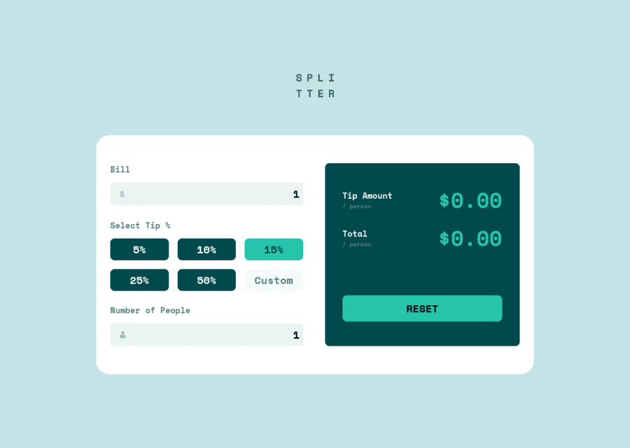
Design comparison
Solution retrospective
Feedback is appreciated
Community feedback
- @achrustowskiPosted over 2 years ago
Hi RuFa,
Congrats on your solution! It looks great and it's a nice touch to have a prompt for Custom tip value :)
As for improvements, you have some repetitions in you JS code, you could put
gridButtons.forEach(btn => { btn.setAttribute('style', 'pointer-events: auto'); btn.classList.remove('btn-clicked'); });andbutton.classList.add('btn-clicked'); button.setAttribute('style', 'pointer-events: none');inside of a function and call it whenever you need to use it. This will clean up the code a little bit and make it more readable.Lastly, completely UI thing, looks like your 15% button is clicked by default, not sure if this is intended, just my observation.
Hope this help! Adam
Marked as helpful1@RuFuRuPosted over 2 years ago@achrustowski Hello achrustowski,
The 15% button isn't clicked by default. I was a bit confused by the pictures provided by this challange and I though this button was supposed to be differently coloured from the rest.
I will change it later if it's too jarring
Thanks for the feedback
0
Please log in to post a comment
Log in with GitHubJoin our Discord community
Join thousands of Frontend Mentor community members taking the challenges, sharing resources, helping each other, and chatting about all things front-end!
Join our Discord
