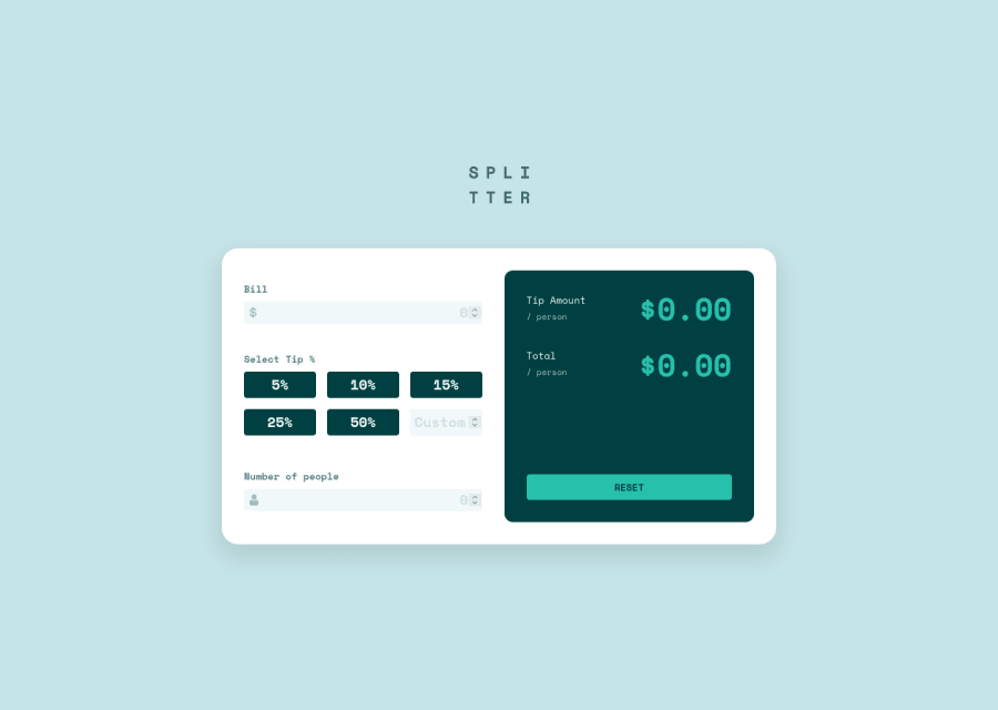
Design comparison
Solution retrospective
I would be very glad for any advices about accessibility features. I try to learn more about this topic and made some imporvements in this matter. Any other advices would be very nice too :)
Community feedback
- @AlexKMarshallPosted about 3 years ago
This looks good. There are just a few things in terms of accessibility that could do with fixing.
Mostly the heading levels. Headings should read like a table of contents. So you have a single
<h1>
and then your sub-headings, sub-sub-headings etc flow from that in the correct order never skipping a level.So in this app only really the app name itself is a heading, as it's basically one big form. You've used headings for the output of the calculations for instance. These don't really make sense to be headings. Either the 'tip amount / person' text could be a heading. Or you could make the calculated value an
<output>
and use<label>
as you would any other form control.The tip buttons probably make more sense as a series of radio buttons, as this is something where you make a selection, and you can only select one. And then wrapped in a fieldset. Doing it that way means you can avoid adding all the
aria-pressed
in the javascript too. A button witharia-pressed
state would be a sensible choice if this was a series of independent switches on a settings page, where each could either be on or off.I'm not sure what the reason for the
tab-index="0"
that you have put on your output container. and on the tip section wrapper. Generally we would only ever settab-index="-1"
, and then only for things that we want to programatically set focus to. Giving these a tab index of zero now means they can be tabbed into. But they aren't interactive controls, so that shouldn't be possible.As far as other keyboard navigation, make sure your focus states are clearly visible. They're fine on the text field, but far too low contrast on the tip buttons.
Marked as helpful1@pawel975Posted about 3 years ago@AlexKMarshall thanks for your answer! Tabing for output was enabled for screen reader to read the output tip, is that making any seanse or should I do it other way?
0@AlexKMarshallPosted about 3 years ago@pawel975 If you make it a live region then screen-readers will automatically read out any changes to the content inside it, and that won't break tabbing.
If you use an
<output>
element linked to the inputs that impact it, then it does it for you without having to set up any extra aria attributes. https://developer.mozilla.org/en-US/docs/Web/HTML/Element/outputMarked as helpful1
Please log in to post a comment
Log in with GitHubJoin our Discord community
Join thousands of Frontend Mentor community members taking the challenges, sharing resources, helping each other, and chatting about all things front-end!
Join our Discord