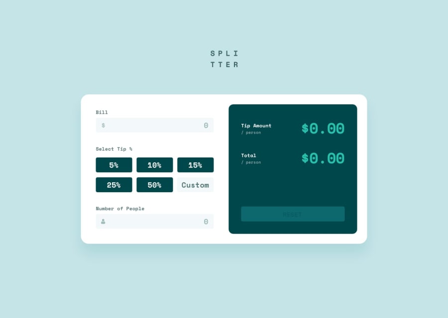
Design comparison
SolutionDesign
Solution retrospective
I was informed that my mapped button components would be better for accessibility if they were radio buttons. This makes sense! What are other ways to make this app more accessible?
Community feedback
- @shashreesamuelPosted over 2 years ago
Hey good job completing this challenge
keep up the good work
your solution looks great however I think that the card has a bit too much margin from the top.
In terms of your accessibility issues simply wrap all your content between
maintagsI hope this helps
Cheers Happy coding 👍
0
Please log in to post a comment
Log in with GitHubJoin our Discord community
Join thousands of Frontend Mentor community members taking the challenges, sharing resources, helping each other, and chatting about all things front-end!
Join our Discord
