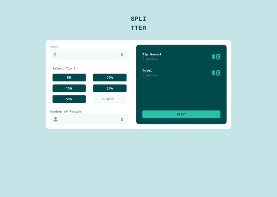


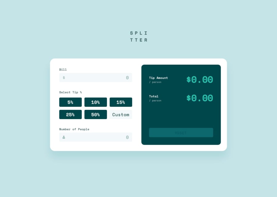
Design comparison
SolutionDesign
Community feedback
- @codi-AndrePosted 6 days ago
Nice, it is really close to the design.
The tips layout needs to be three columns on desktop, but mine got the placeholder text chopped.
The key to improve here is how you handle "white space", increasing the padding in some areas on desktop view will make it looks better.
Marked as helpful1

Please log in to post a comment
Log in with GitHubJoin our Discord community
Join thousands of Frontend Mentor community members taking the challenges, sharing resources, helping each other, and chatting about all things front-end!
Join our Discord