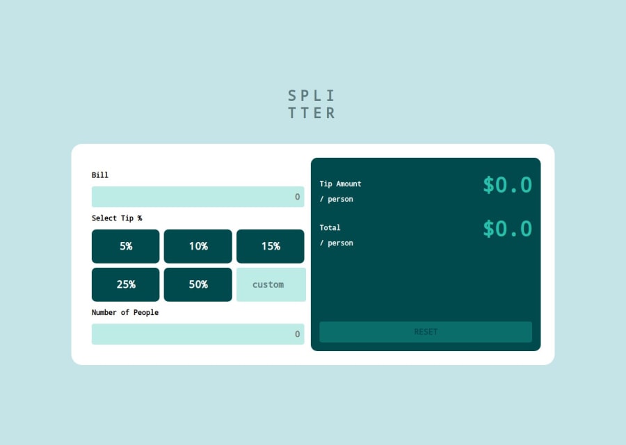
Design comparison
SolutionDesign
Solution retrospective
What challenges did you encounter, and how did you overcome them?
In CSS,
I learned how to implement responsive design within a single file, adopting a mobile-first approach. This not only streamlined the code but also significantly reduced its overall size.
In JavaScript,
I gained proficiency in managing multiple UI states, allowing for more efficient and dynamic handling of user interactions.
Community feedback
Please log in to post a comment
Log in with GitHubJoin our Discord community
Join thousands of Frontend Mentor community members taking the challenges, sharing resources, helping each other, and chatting about all things front-end!
Join our Discord
