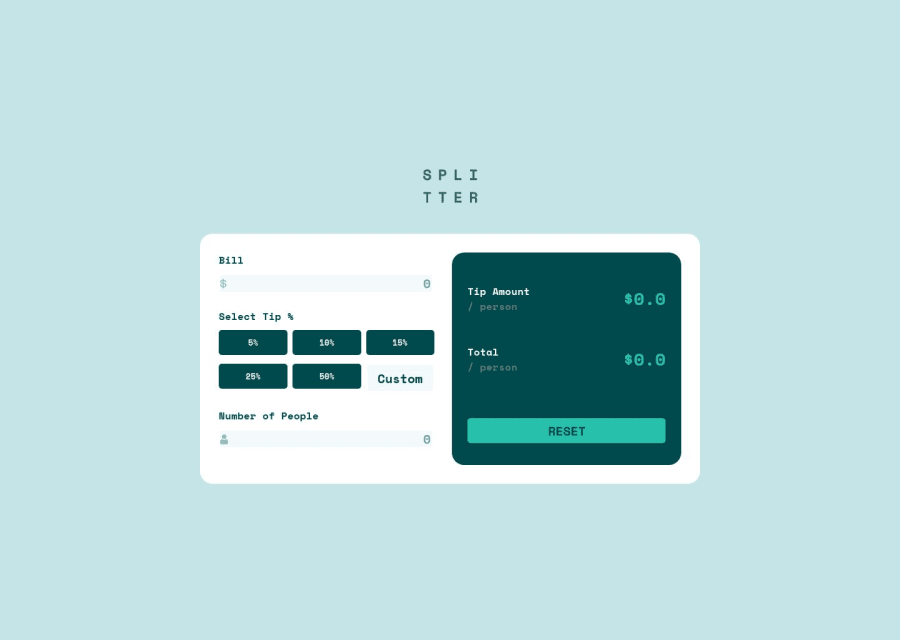
Tip calculator using React, Sass, CSS Grid.
Design comparison
Solution retrospective
What do you guys think about the responsiveness? What do you think about the visual aspect of the page? does it look good? What are some practices that you think can be improved?
Community feedback
- @kwngptrlPosted over 1 year ago
Very nice. Just nitpicking: Perhaps add some padding on the Bill and Number of People fields as the border is a little too close. Also, the border on Number of People is non-existent on focus unlike Bill's. No error message if Number of People is zero as per the design file.The numbers in Select Tip% are a tad too small.
0@RicardoFuentes437Posted over 1 year ago@kwngptrl Thanks for your suggestions, you're right about the border of Number of People, i must've forgotten to add it hahaha. Are you sure about the error message not showing? it does show on my computer when i enter a "0". Again, thanks for your suggestions :)
0@kwngptrlPosted over 1 year ago@RicardoFuentes437 Oh, okay. I see it now. Pressing reset doesn't clear it though. It's by design, I assume. Yes, this project's a little weird for me. I once thought the reset button should say 'submit' or 'calculate' and only change to 'reset' if there are values...Okay, I'm rambling now.
0
Please log in to post a comment
Log in with GitHubJoin our Discord community
Join thousands of Frontend Mentor community members taking the challenges, sharing resources, helping each other, and chatting about all things front-end!
Join our Discord
