Design comparison
Solution retrospective
Hi everyone,
I have a couple of issues.
First, when I use a media query to adjust the CSS for mobile devices and I try to set a max screen size, it then seems to work just fine while I check on my desktop computer and adjust the browser window to simulate having a smaller screen. But once it's all done and the final result is published, I then use my actual phone to check and it will display the layout designed for much larger screen sizes. When I check my phone's settings, it says that the screen resolution is 1920x1080. But obviously my phone's screen is actually way smaller than the browser window on my PC, even when the latter is set to something like 600px x 900px. So I wonder whether there is a better way to make the CSS responsive for mobile devices using not the screen's resolution but its actual size.
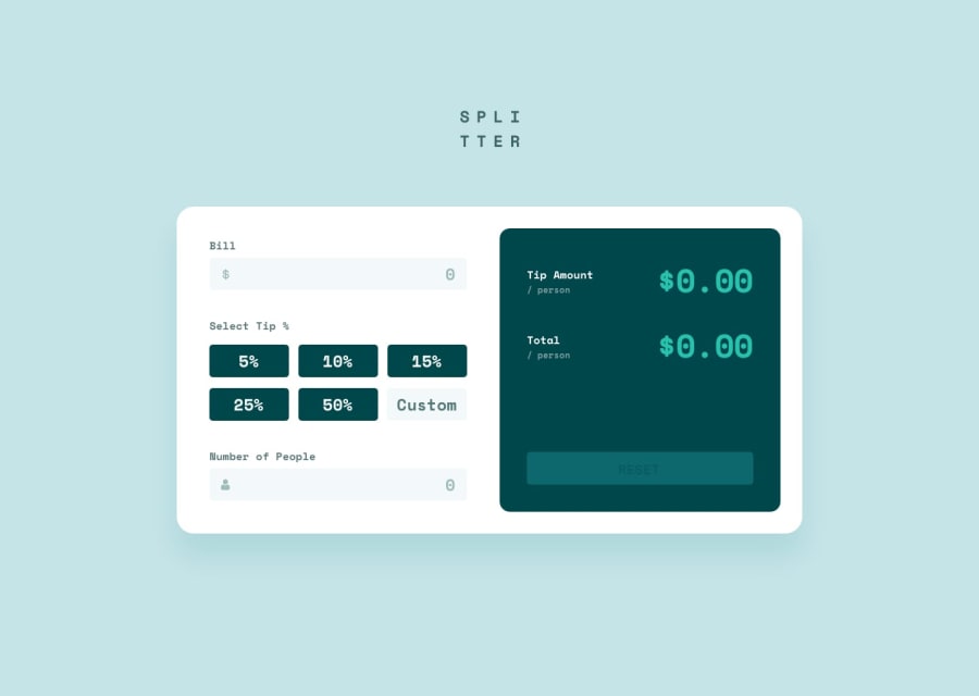
Secondly, I had some difficulty making the output section of the calculator (i.e. the right half which includes the resulting tip per person and the total amount etc.) look neat. So I eventually reverted to making the whole section into a table. If I remember correctly, once upon a time, I read that you shouldn't use this workaround for anything other than actual tables. So I wonder, my way of using an HTML table to make sure all the different headings and resultes and so on look nice in order, is this something that is acceptable among professional developers or is it frowned upon?
Cheers for any feedback!
Community feedback
- @Omid-HeidarzadehPosted about 3 years ago
Hi Phil, this is a success, you have finished the job, although as you mentioned, there is still room for improvement. The first problem is that you did not add the meta viewport tag to the page header. This tag tells the browser to adjust the page width according to the page size.
<meta name = "viewport" content = "width = device-width, initial-scale = 1>The second problem is one of the main challenges that every developer faces in all projects, but the level of experience and skill are their main differences. I recommend that you first look at the details of the CSS Box model and the usual (or sometimes weird) ways to change the appearance and layout of elements (ie margin, padding, text-align, float, vertical-align, line-height, display, position, width, height, top, left, right, bottom, etc.). It is then essential to learn modern methods for arranging elements such as Flexbox and Grid. These two methods are a little bit tricky to learn at first, but once you understand them, you will not give up using them. As another suggestion try to see each page design in smaller boxes and plan. For example in this challenge "tip amount", "/ per person" and its relevant number are a good candidate to be in a wrapper element like
<div>which is a block-level element (instead of<tr>element) and it takes all available horizontal space in its parent element.Keep up the good work, Have a good day, and happy coding ;)
0
Please log in to post a comment
Log in with GitHubJoin our Discord community
Join thousands of Frontend Mentor community members taking the challenges, sharing resources, helping each other, and chatting about all things front-end!
Join our Discord
