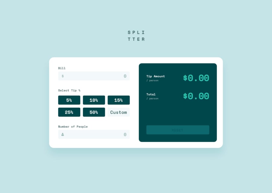
Tip Calculator using ES6 classes and mobile first workflow
Design comparison
Community feedback
- @MarlonPassos-gitPosted about 3 years ago
hello, I really liked your project, with the right focus effects, the logic working well, the design very similar to the original version. Now some points I saw in the design that you could improve on.
-
the designer breaks down very quickly for the mobile version, the elements are very stretched out, see https://prnt.sc/1tlhki6
-
And when the screen decreases a little below 375px the number of people display is cut in half, see https://prnt.sc/1tlhydx
-
The reset button is a little dark, in the original version it is a little lighter color when disabled. A very stupid detail
1@heyitsganyPosted about 3 years ago@MarlonPassos-git thank you for the feedback!
- I'll definitely look into the layout for tablet sizes, it looks as though it's an easy fix.
- As for the second point you make, the problem only arises below about 313px, which is smaller than the commonly accepted minimum screen size for phones (at 320px).
- I could tweak the opacity on the reset button when it's inactive, but like you say, it's a tiny detail!
0 -
Please log in to post a comment
Log in with GitHubJoin our Discord community
Join thousands of Frontend Mentor community members taking the challenges, sharing resources, helping each other, and chatting about all things front-end!
Join our Discord
