Design comparison
Solution retrospective
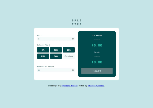
My second solution here, still learning good costumes during code process. I changed some lit of design because i cannot copy exactly the layout.
Thank you soo much to some of you who your precious time helping me with tips.
Community feedback
- @petritnurediniPosted 9 months ago
Congratulations on completing the Tip Calculator App project! Your work shows a great understanding of HTML, CSS, and JavaScript. Here are some short suggestions to enhance your project:
-
Semantic HTML: Use more semantic elements like
<header>
,<footer>
, and<section>
for better structure and accessibility. Explore more about semantic HTML here. -
CSS Best Practices: Try to keep your CSS selectors minimal and avoid deep nesting. This improves readability and maintainability. Learn more here.
-
Responsive Design: Ensure the design is responsive on various devices. You might want to use a mobile-first approach and use media queries to adjust the layout for larger screens. Check out this guide on responsive design.
-
JavaScript Input Validation: Your script handles input validation well. Consider also validating the input format (e.g., no negative numbers, reasonable tip percentages).
-
Accessibility: Make sure all interactive elements are accessible, including keyboard navigation and screen reader compatibility. Find out more about accessibility here.
-
Code Organization: Organize your JavaScript and CSS files into meaningful sections and use comments where necessary. This makes your code easier to read and maintain.
Keep up the fantastic work! The skills you're developing will be invaluable as you continue to tackle more complex projects and challenges in web development.
0 -
Please log in to post a comment
Log in with GitHubJoin our Discord community
Join thousands of Frontend Mentor community members taking the challenges, sharing resources, helping each other, and chatting about all things front-end!
Join our Discord