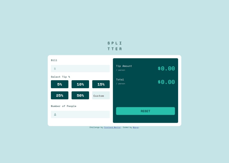


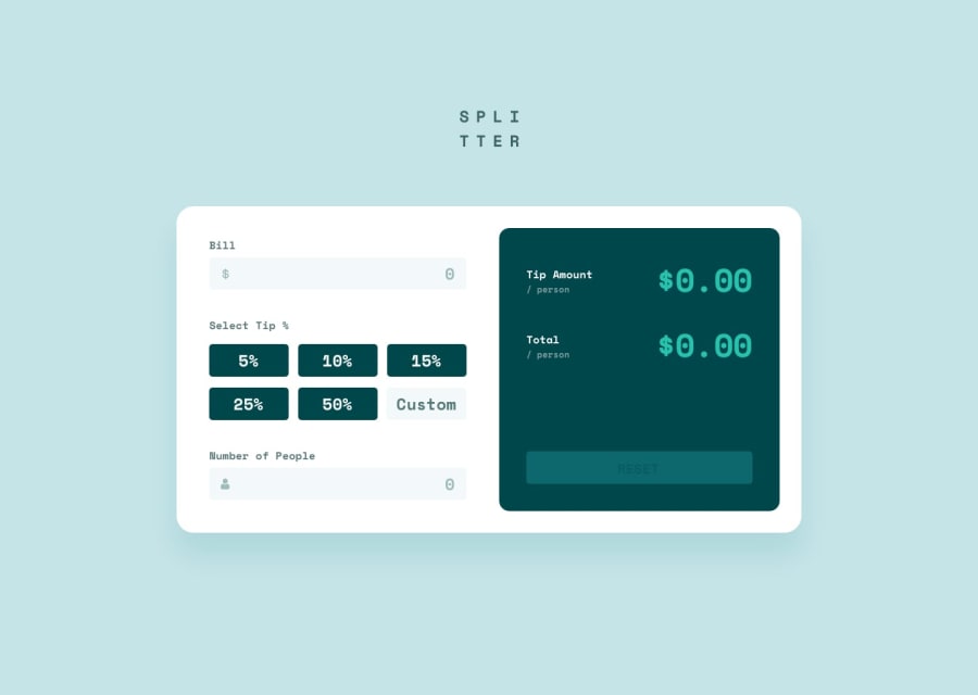
Design comparison
SolutionDesign
Solution retrospective
What specific areas of your project would you like help with?
Any help in improving JavaScript will be appreciated
Community feedback
- P@theoriginaltudorPosted about 2 months ago
- you could add a placeholder
- with css you can easily hide the arrows from the input number
- you could add a min attribute to the input so no negative values can be inputed
- you could disable the tip selector until all the fields are having some kind of value so you don't get NaN as a result
- the design seems to have more contrast. Is it because it uses different font weights?
- a bit more white space for the outer container would make the UI feel a bit better
- you could disable the reset button as long as there is no data inputed yet
Marked as helpful0

Please log in to post a comment
Log in with GitHubJoin our Discord community
Join thousands of Frontend Mentor community members taking the challenges, sharing resources, helping each other, and chatting about all things front-end!
Join our Discord