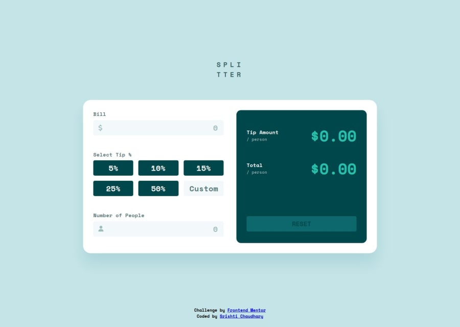
Design comparison
Solution retrospective
I'm proud of finishing the project.
What challenges did you encounter, and how did you overcome them?I found it challenging to figure out how to make custom input work without a button. I decided to create a button for custom input for an easy user experience.
What specific areas of your project would you like help with?Anything that you feel can be improved upon.
Community feedback
- @hannibal1631Posted 5 months ago
Well great job! This works as it should. But there is a big change you should consider. The page is way too big looking and the footer is overlaying the container.
My advice, don't use the footer and make the container small by just using
transform:scale(0.8). It'll decrease the overall size of the box, play with the size to fit properly.Also use the script tag inside body, not on the head.
There is a small bug on your inputs as well, it takes negative value which should not be the case. Just a small tweak on js and it'll be good to go.
Happy coding!!!
0@hannibal1631Posted 5 months ago@itsmesrishti you're welcome...
btw can we connect??
0
Please log in to post a comment
Log in with GitHubJoin our Discord community
Join thousands of Frontend Mentor community members taking the challenges, sharing resources, helping each other, and chatting about all things front-end!
Join our Discord
