Design comparison
Solution retrospective
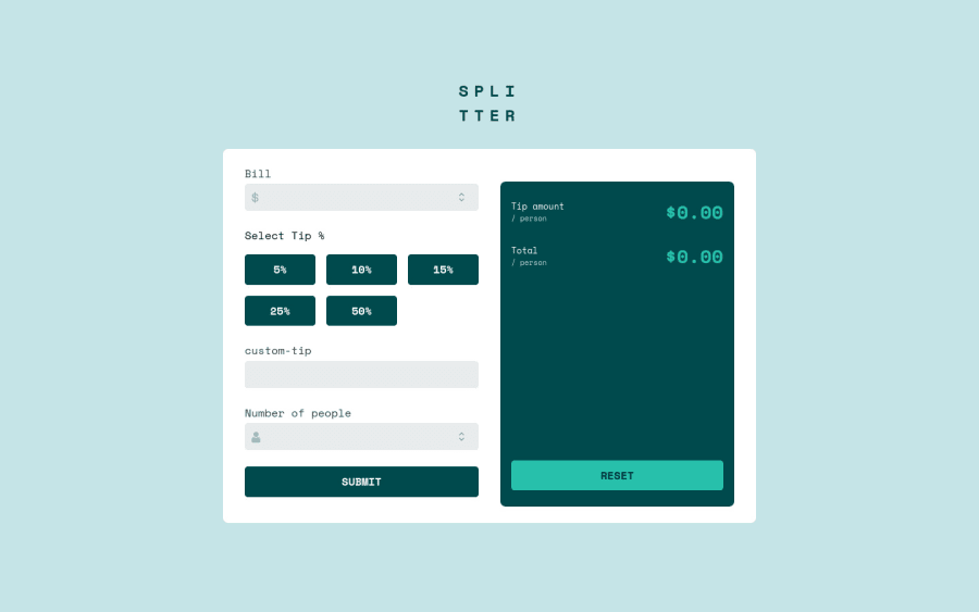
I tried to make it accessible as I could. I modified the custom tip so that it has a label instead of a placeholder as placeholders are not accessible. and I added a submit button to the form on the left to add on option to submit the form using something other than keyboard I relied on the HTML validation only because I'm lazy to do it with JS All feedbacks are welcome, especially about accessibility and the Javascript
Community feedback
- @pikapikamartPosted about 3 years ago
Hey, great job on this one, and really glad that you focus on accessibility for this challenge. This is hard to make one accessible, since most solutions changes data for every input which can be confusing for users who might use it using assistive techs. The layout in desktop is good and the mobile layout is great as well.
Some suggestions would be:
- On the
h1
that would be read wrong by screen-reader. Do not break a single word, if you did that, instead of reading "splitter" it will be read as "s" "p" "l"... letter by letter. But since you usedaria-label
it will be right, but the proper way on this one would be addingmax-width
on theh1
then useword-break: break-all
. This way, letters that are beyond themax-width
will get wrapped, and you won't need to addaria-label
and thosespan
could be removed. - No need to use
aria-labelledby
on theform
. - For the tip selection section, using
button
plainly on those doesn't really add any accessibility at all. Since those are selections, you could useinput type="radio"
on those, that way, it will be more clearer that a user "selected" something, and if the user selects the custom tip input, then you could just:
pseducode currentRadioButton.checked = false;
So that you could disable the selection made on the
input type="radio"
.- You could use
aria-live
element, to which be used when theform
is submitted. Informing the user that it has been submitted, because plainbutton
does not add many extra information. - On the
dl
element, avoid using any other html element inside it unless it isdt
anddd
element. You useddiv
inside it which is wrong. - The
tip amount
and total could be using heading tag as well. - Same for the reset button, it would be great to have
aria-live
informing that the form is has been reset.
For some js:
- Use
.map
instead of.forEach
if you are changing data inside of the array, since you are "mapping" and applying listeners. - Also, maybe add some validation on some inputs like preventing inputting negative values.
Other than those, great job again on this one.
Marked as helpful1@Anwar11234Posted about 3 years ago@pikamart Thank you very much, my friend. Your feedback is packed with great tips and positive energy.
0 - On the
Please log in to post a comment
Log in with GitHubJoin our Discord community
Join thousands of Frontend Mentor community members taking the challenges, sharing resources, helping each other, and chatting about all things front-end!
Join our Discord