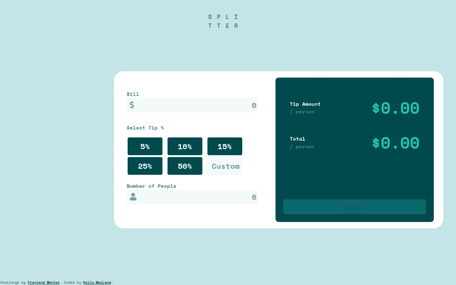
Design comparison
Solution retrospective
Any good reading on styling ONLY active/selected buttons, and returning previously selected buttons to a non-selected style? I gave up :(
Community feedback
- @pikapikamartPosted about 3 years ago
Hey, ughm. Did you code on this on a large screen? The layout for me is bad since it is really big. But zooming out, the layout seems kinda nice, just the size needs to be fixed for other screen resolutions. The mobile layout is good, just needs a little bit of
padding
to the left and right side of thebody
to prevent it from touching the sides.Regarding your concern, Conrad already said a great tip about that. But let me explain it a bit more. Well to be more clearer, I'll just create a small snippet that you can look. If that is your desired outcome, if it's not, just drop it here and maybe I can help with it.
Some suggestions would be:
- Of course first, make the layout be good and responsive in other screen resolutions as well and not only for large screens.
- You don't really need to adds stylings on the
html
element. Typically, on thehtml
element, you would just see these stylings:
html { box-sizing: border-box; # or any other box-sizing values font-size: 100%; }
Instead of applying it on the
html
element, apply it on thebody
tag.- The
.container
selector that holds the tip calculator itself, I would not recommendposition: absolute
on it. Leave it on the flow. If you try to inspect your layout in dev tools, hover on thebody
tag. You will see that thebody
have a small dimension and doesn't really captures the calculator itself. That is the effect ofposition: absolute
. - A website needs to have at least 1
h1
tag. On this one, it could be the "SPLITTER" text, or it could be a screen-reader only text. - On the
input
of the calculator, on the bill. You can see that when it has focus, it shifts a bit the elements at the bottom, this is because you are adding aborder
to it right. To make it not do that, make the element already have theborder
but the color of it istransparent
. It would be like:border: 3px solid transparent
and when it have thefocus
just transition theborder-color
. This way it won't shift the element. You can apply this on other input elements on your solution. - I think that the logic on your tip calculator is not correct? Checking that one out would be really great.
- This challenge could have used more accessibility features, but if you are starting out, it's fine, but as you go along, remember to add accessibility as a goal on websites.
Other than those, great work.
1 - @ConradMcGrifterPosted about 3 years ago
You can make a css class with the active styles and then toggle it on and off with javaScript
0
Please log in to post a comment
Log in with GitHubJoin our Discord community
Join thousands of Frontend Mentor community members taking the challenges, sharing resources, helping each other, and chatting about all things front-end!
Join our Discord