Submitted almost 3 years ago
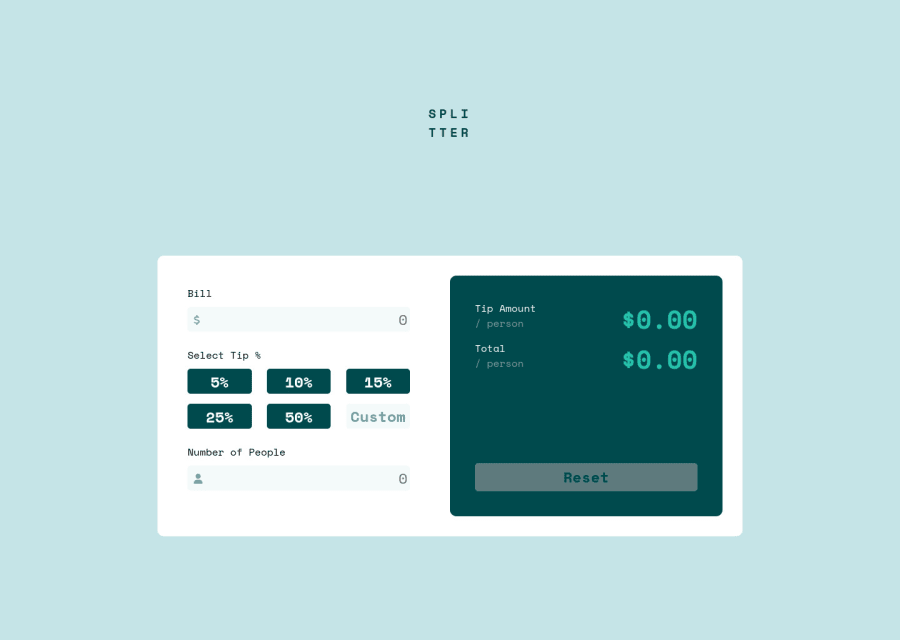
Tip calculator: CSS, SASS, Vanila JavaScript
@AhmedSaidi99
Design comparison
SolutionDesign
Solution retrospective
Any suggestions, advice I'll be appreciate it
Community feedback
- Account deleted
Hi there 👋
Congratulate on finishing your project 🎉. You did a great job 💡
I give some suggestions to help you take your project design to the next level 📈😉
- Change the color of reset button color to green. You can find the colors from the starter file and design image
- Let's add also some padding to input fields 👍, it will be easier to enter the number
- Use this code to add box-shadow to the card 👌
box-shadow: 0 16px 32px hsl(180deg 51% 52% / 10%)
Happy coding ☕
Maqsud
Marked as helpful0@AhmedSaidi99Posted almost 3 years ago@maqsudtolipov Thank you Maqsud for your helpful feed 👍
1 - @Aadv1kPosted almost 3 years ago
Great job on nailing the layout; I liked your gulp setup, even I have one Would love to get some advice on this file.
Marked as helpful0@AhmedSaidi99Posted almost 3 years ago@Aadv1k Nice one, If you work with frameworks like bootstrap or tailwind I would suggest purge-css plugin. Purgecss is a gulp plugin that removed all unused css selectors.
KEEP GOING 📈
1
Please log in to post a comment
Log in with GitHubJoin our Discord community
Join thousands of Frontend Mentor community members taking the challenges, sharing resources, helping each other, and chatting about all things front-end!
Join our Discord
