


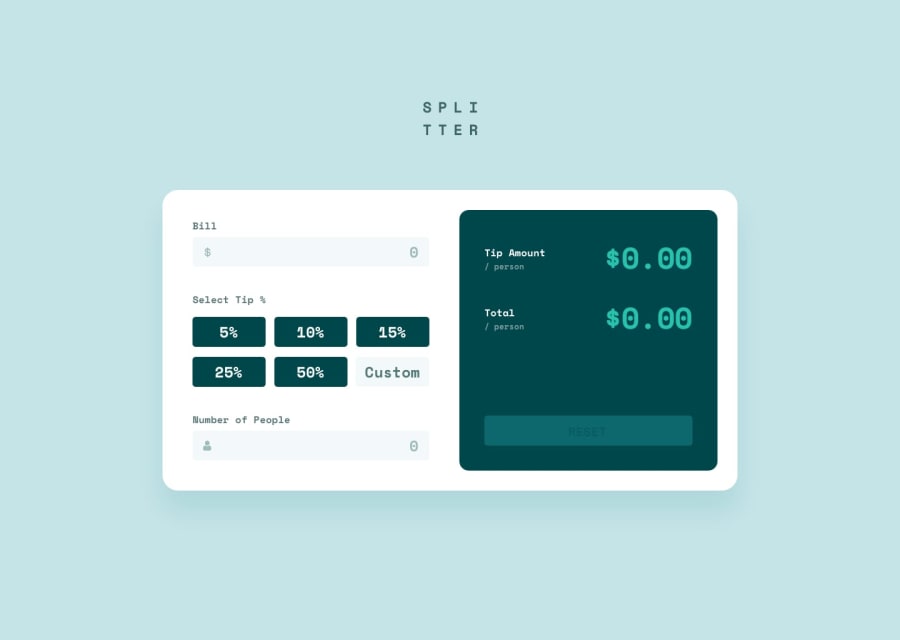
Design comparison
SolutionDesign
Solution retrospective
What are you most proud of, and what would you do differently next time?
Most proud of Javascript, especially adding validation and calculations
What challenges did you encounter, and how did you overcome them?Validating inputs
What specific areas of your project would you like help with?Semantic html and refactoring JavaScript
Community feedback
- P@joshhovisPosted 9 months ago
You are on the right path. It's mobile responsive, which is good.
You just need to go in and make some styling edits to better match the design. Things that should be changed just from glancing:
- Font needs to be the Space Mono
- Font should be bolded and colored to match the colors provided in the styling guide
- For bigger screens, you should change the grid alignment in the tips-container to be
grid-template-columns: repeat(3, 1fr); - And then use the logo included in the images instead of typing out 'Splitter'
0

Please log in to post a comment
Log in with GitHub
Join our Discord community
Join thousands of Frontend Mentor community members taking the challenges, sharing resources, helping each other, and chatting about all things front-end!
Join our Discord