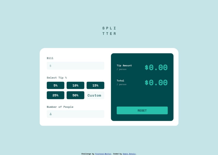
tip calculator challenge using object oriented programming
Design comparison
Solution retrospective
any ways for improving my code
Community feedback
- @ChamuMutezvaPosted about 1 year ago
Hi AEMRO
This is a follow up on my earlier communication on discord, but on this one I will provide feedback on this challenge. Take note that I will mainly focus on areas that I believe needs improvement
- i see that this div
<div action="#" class="input-for-the-tips">
, theaction
attribute is associated with the form element. Using semantic elements is encouraged as that will make your site accessible with a few more extra code and even without. In this case , you should be having a form element instead of the div . Since it is a form , it has to be keyboard accessible. - the error messages should have the
alive-live
attribute with a value ofpolite
, that allows the user to be notified when the error happens - the buttons for the tips is another talking point, since we can only choose one tip at a time, this then will make us choose radio buttons (that's what radio buttons are meant to do). Remember some users cannot visually see the screen, using the correct semantic element will not cause confusion.
- using the
br
element is considered bad practice - it is problematic to people who uses screen readers. Use css to achieve the design. See the following article br accessibility concerns - the designs that you download are not meant to be media queries breakpoints , they just show you how your finished product should look like at those given sizes. The breakpoints are for you to decide, you site should be responsive.
- The functionality will need some panel beating as well, it works when you enter
the number of people
at the last point.
Marked as helpful0@aemrobePosted about 1 year ago@ChamuMutezva thanks, it was really helpful. I have made the changes as you recommended to me. I will be glad if you review the changes I made to it.
0@ChamuMutezvaPosted about 1 year ago@aemrobe
- on the error messages I mentioned to set the
aria-live
topolite
, the same should be done to the totals. What that does is , when using assistive tech, the change of values will be announced to users - that is very beneficial to someone who can not see the screen. Setting thearia-live
tooff
should be avoided as that is the default setting anyway. - test you site using a keyboard only , see if all interactive elements are being focused when tabbing with the tab key. Somehow the radio-buttons are not being selected. I would suggest using a Fieldset to wrap the radio buttons
- take note as well on the issue of media queries, the one and only one 1440 is not ideal. The image designs are not meant to be media queries.
- the custom input element should also have a label as any other input elements.
0@aemrobePosted about 1 year ago@ChamuMutezva I also target the tablet view by using the max-width after I make the design for the mobile view then after I target for the latptop view. what else should I make. the other one is even if I wrap all the tip buttons and custom input in the fieldset still the radio buttons are not accessible. what should I do.
0@ChamuMutezvaPosted about 1 year ago@aemrobe
Hello once again. Let me first address the issue with the radio buttons. The reasons why the radio buttons are not accessible is because in your css have removed them by the following code
input[type="radio"] { display: none; }
you have to use other css methods to visually hide the radio buttons, probably using a sr-only class. I have made some adjustment below to include a
legend
andlabel
for the custom input element<fieldset class="button-list"> <legend>Select Tip %</legend> <div class="input-wrapper"> <input id="percent-5" name="tip-percentage" type="radio" value="5%" /> <label class="tip-button" for="percent-5">5%</label> </div> <div class="input-wrapper"> <input id="percent-10" type="radio" name="tip-percentage" value="10%" /> <label class="tip-button" for="percent-10">10%</label> </div> <div class="input-wrapper"> <input id="percent-15" type="radio" name="tip-percentage" value="15%" /> <label class="tip-button" for="percent-15">15%</label> </div> <div class="input-wrapper"> <input id="percent-25" type="radio" name="tip-percentage" value="25%" /> <label class="tip-button" for="percent-25">25%</label> </div> <div class="input-wrapper"> <input id="percent-50" type="radio" name="tip-percentage" value="50%" /> <label class="tip-button" for="percent-50">50%</label> </div> <input type="number" placeholder="Custom" name="custom-tip" class="custom-tip" id="label--select" /> <label class="label label--select" for="label--select">Enter Tip</label> <!--You can hide this using sr-only class--> </fieldset>
- the reason behind this is to group each set of radio button in the wrapper div then it will make the grid manageable and this way if I apply the following code
.input-wrapper { position: relative; } input[type="radio"] { position: absolute; // add any other css to visually hide the radio button // it may be better to use a css sr-only class }
You will only need one media query here, the 64rem
Marked as helpful0@aemrobePosted about 1 year ago@ChamuMutezva thanks for detail description on what should I do. I really appercieate that.
0 - i see that this div
Please log in to post a comment
Log in with GitHubJoin our Discord community
Join thousands of Frontend Mentor community members taking the challenges, sharing resources, helping each other, and chatting about all things front-end!
Join our Discord