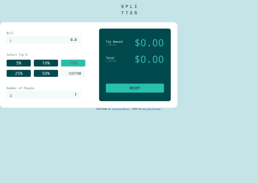
Design comparison
Solution retrospective
Proud of sludging through it. The design part of the project was easy it was the JavaScript that was rough. A ton of research later and my app works.
What challenges did you encounter, and how did you overcome them?Challenges I encountered were utilizing functions and pushing results to be used by other functions. I watched a lot of video and reading.
What specific areas of your project would you like help with?I am unsure of my math logic. I think it is right(?) I would also like help refactoring my code to see if I could make it more legible and easier to read.
Community feedback
- @dylan-dot-cPosted 5 months ago
Well done! This is a decent solution but there are many ways you can improve it.
- Make it more accessible: you can use buttons for any element that has an onClick eventListener on it, afterall they are button and this will make it ussable even by keyboard users. You can also add focus styles so the keyboard user know which element they are at(same for input elements add a border/outline when focused). Also I see you have the for attribute on your labels but you are not giving them a value. It's important to have it assigned to the value of the id of the element the label belongs to. This is helpful in a number of ways especially for screenreaders.
- By default labels are inline elements, there is an issue on larger screens(tablets) it goes up beside the bill input so you could make it block. You could also make put a div around each form group to prevent that(label and inputs).
- I think the breakpoint you have to switch to desktop layout is too large as it will look too stretched on certain sizes for tablets, you could either add a max-width or put the breakpoint at 768px
- the main card/div isn't horizontally centered, you can put the logo and the calculator in a div and then add
justify-content: center; align-items: center;to the css of the body, you can now remove flex-direction: column as row would be what would work here. - Also don't put a fixed width (
990px) ever in CSS, since some screen sized arent that large and it will cause overflow issues. What you can do is sat a max width, around 780px or so so the calculator can grow and shrink flexibly and have a more fluid layout.
Other than that everything should be good and you can spend some time, with AI to critique your code and tell you what you can do better(of course don't copy paste as you can't learn that way). I also completed this challenge so you could take a look at it and the structure of it.
All the best!
Marked as helpful0
Please log in to post a comment
Log in with GitHubJoin our Discord community
Join thousands of Frontend Mentor community members taking the challenges, sharing resources, helping each other, and chatting about all things front-end!
Join our Discord
