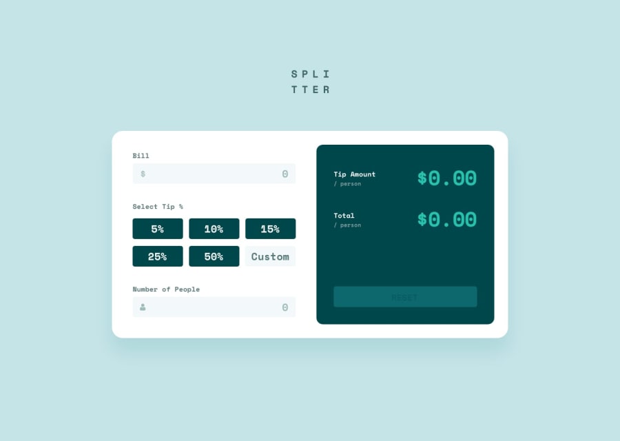
Design comparison
Solution retrospective
I do not think there is anything wrong with the code this time except that it probably does not match the design perfectly, but any feedback is still helpful.
Community feedback
- @SJ-NosratPosted over 3 years ago
Hi, The solution looks good. I'd suggest the following additions to your HTML structure and CSS, as follows:
-
<img src="images/logo.svg">try and add the following attributesaria-hidden="true"since the logo is purely decorative and will help screen readers to skip it. Also the addition of thealt=""will be good pratice. -
<button>5%</button>include thetype="button".
In additon to the other CSS properties add to the
.calculatorclass the following:.calculator { max-width: 75%; margin: 0 auto; }The above will give a nicer look to the calculator not allowing the overall width to expand too much.
- Lastly, it'd be nice to look into using semantic HTML like for example wrapping your
<img>tag in a<figure>tag as this provides more meaning to screen readers.
Hope the above helps!
Wonderful work!
Best of luck with your coding journey!
0 -
Please log in to post a comment
Log in with GitHubJoin our Discord community
Join thousands of Frontend Mentor community members taking the challenges, sharing resources, helping each other, and chatting about all things front-end!
Join our Discord
