Design comparison
Community feedback
- @Fable54321Posted 19 days ago
I won't dig too deep in this one simply because, your react/javascript looks really good to me.
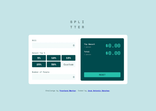
I like the way you have handled the active tip selection. Only thing I could say is the reset button doesn't set the custom to either zero or it's initial "custom".
Apart from this there is obviously some little designs mistakes, but I think you know how to fix these if needed.
The responsiveness is fine, deifnitely functionnal, but I would recommend you to take a look at the clamp porperty while setting your width. I use it to set my preferred width in vw (Knowing the desktop width they use is 1440, I will take the width of the container and convert it in vw).
With clamp you can also set a min value you don't want it to go lower then and a max value you don't want to go higher than. So let's say my preferred value is 60vw but I don't want it to go lower than 550px and not bigger than 1200xp. It will look like this: clamp(550px, 60vw, 1200px). For me this was a game changer, hope it can help you.
Also consider slowly but surely looking for another way of structuring your css. I would suggest either going for modules.css, wich won't take you too long to understand and do a really good job or if you are willing to put just a little more time, maybe look at SASS/SCSS.
Overall good job, keep up !
0
Please log in to post a comment
Log in with GitHubJoin our Discord community
Join thousands of Frontend Mentor community members taking the challenges, sharing resources, helping each other, and chatting about all things front-end!
Join our Discord