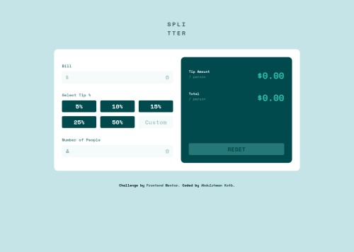
Design comparison
Solution retrospective
I would very much love to know if I did well with my Javascript code and if there are improvements.
So feel free to provide feedback. I would be very happy if you tell me how I can improve.
Community feedback
- @pikapikamartPosted almost 3 years ago
Hey, awesome work on this one. Desktop layout looks nice, site is responsive and mobile state looks really nice as well.
I don't really review javascript that much :>, but for some other suggestions, here are some:
- For your
h1
, you shouldn't have done that.
- When making a text uppercase, do not directly type the word in the markup capitalized. Doing this results screen-reader reading the text letter-by-letter and not by word. Instead just use regular lowercase text and just use
text-transform: uppercase
on it on the css. - Breaking a word using
br
will prevent it from reading properly. A simple workaround on that would be adding amax-width
on theh1
and useword-break: break-all
. Adjust themax-width
until you get your desired result.
- No need to use another
form
tag for the right side, you can just use a singleform
to wrap all the content. - Trying an invalid input, the error-message should have its own html tag and not being used as content of a pseudo-selector. A more proper way of linking error-messages for
input
looks like this:
if ( input is wrong ) input.setAttribute("aria-invalid", "true"); input.setAttribute("aria-describedBy", id of the error-message); else input.removeAttribute("aria-invalid"); input.removeAttribute("aria-describedBy");
The error-message element should have an
id
attribute which is referenced by thearia-describedBy
attribute on theinput
element. By doing that, your user will know that the input is wrong because ofaria-invalid
and they will know what kind of error they made because of thearia-describedBy
.- Since you are using a set of
button
, it would be better if you wrap it inside of aul
tag so that user will know how many items are there in the list. Also,button
alone is not informative specially when it is toggled, there is no indications. For this, maybe adding anaria-live
element that will announce if abutton
has been selected. For example, I toggled the 5%-button, thearia-live
element will announce something like5% tip selected
. Have a search aboutaria-live
. - Another approach would be to use radio-buttons for the 5 tips. Since it is a selection, radio buttons are intended for those. On this, have a
fieldset
as the main-container of the 5 radio-buttons, alegend
tag where its text-content should be theselect tip
:
<fieldset> <legend>Selec tip</legend> <div class="input__container"> <label for="input id">...</label> <input type="radio" name="tip" id=""> </div> </fieldset>
Using that approach is much easier since it will always announce what is selected by the user.
- The custom-input currently lacks associated
label
to it or anaria-label
to which will define the purpose of theinput
element. Always include it so that user will know what they need to give on eachinput
. - Currently, other user will have trouble knowing what result their calculation have made. You can again use
aria-live
element that will announce each result for the tip-amoun and the total but that would be much harder. You can useoutput
as well if you don't want to manipulate extra things. Have a search about that one. - For the reset-button, always have a
type
attribute especially whenbutton
is inside aform
. For this one, you can just use thetype="reset"
so that it will clear allinput
fields inside theform.
That is why I suggest only using a singleform
on this one.
Aside from those, great job again on this one.
Marked as helpful1@abdo-kotbPosted almost 3 years ago@pikapikamart
Thank you so much, I really appreciate you taking some of your time to give me this valuable feedback.
Some of your suggestions, especially those which are concerned with accessibility, are kind of new information to me. So I am searching about them, and I will start implementing them once I feel comfortable with the new stuff.
Thanks again for your time and help!
1 - For your
Please log in to post a comment
Log in with GitHubJoin our Discord community
Join thousands of Frontend Mentor community members taking the challenges, sharing resources, helping each other, and chatting about all things front-end!
Join our Discord